
La Tienda de Manila - BAR - MED, CO
La Tienda de Manila is a contemporary take on the traditional Colombian tienda de barrio — a place for aguardiente, shared bites and the kind of unpretentious gathering that once defined everyday neighborhood life. Created from the ground up in Medellín, the brand brings the warmth, humor and visual memory of an older Colombia into a new setting.
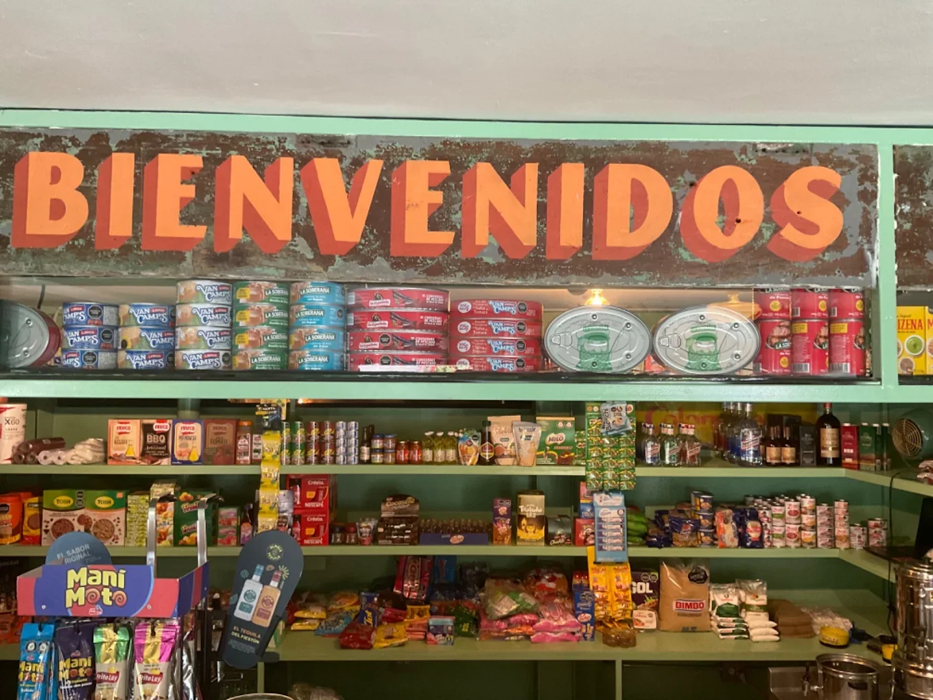
“A new bar designed to feel like a memory of simpler days”
THE BAR
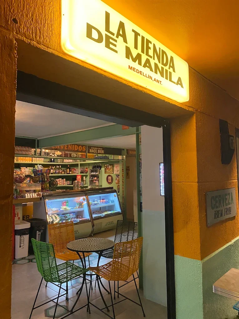
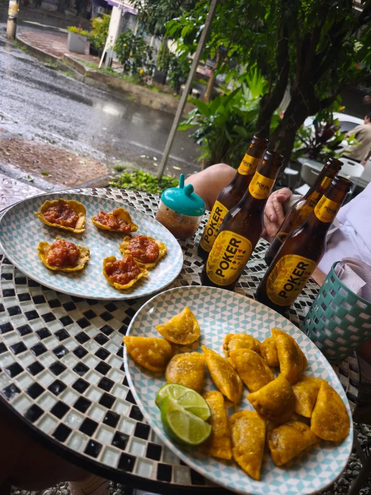
La Tienda de Manila reimagines the Colombian neighborhood store as a place to eat, drink and linger. The concept celebrates the rituals around aguardiente, empanadas, picadas and familiar Colombian snacks — food made for sharing rather than ceremony. Set within one of Medellín’s more polished social districts, the restaurant intentionally looks backward: toward a time when life felt more local, less globalized and a little slower. The result is informal and folkloric at heart, but carefully considered in its execution.
THE OPPORTUNITY
An......The challenge was to create an entirely new brand that could feel nostalgic and instantly familiar without becoming a replica of the past. In a contemporary, higher-end setting, La Tienda de Manila needed to retain the spontaneity and charm of a traditional tienda while feeling intentional enough to belong in its new context. The opportunity was to turn that contrast into the identity itself.
OUR APPROACH
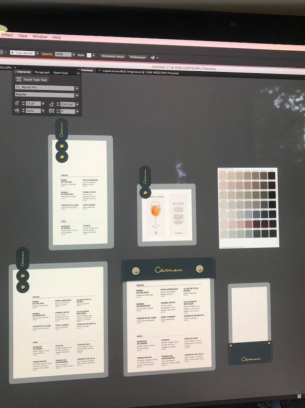
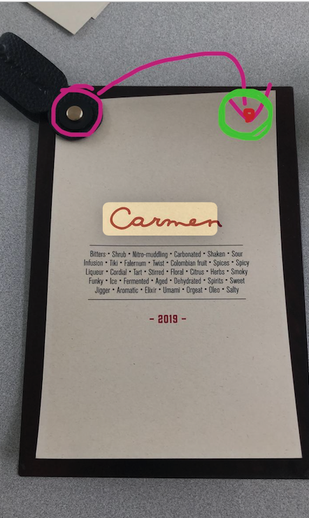
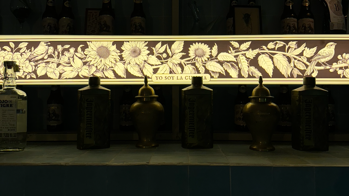
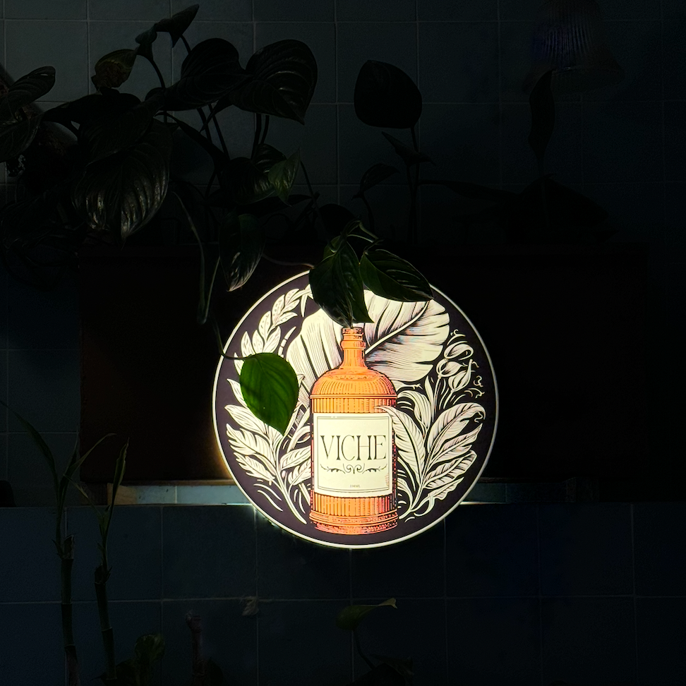
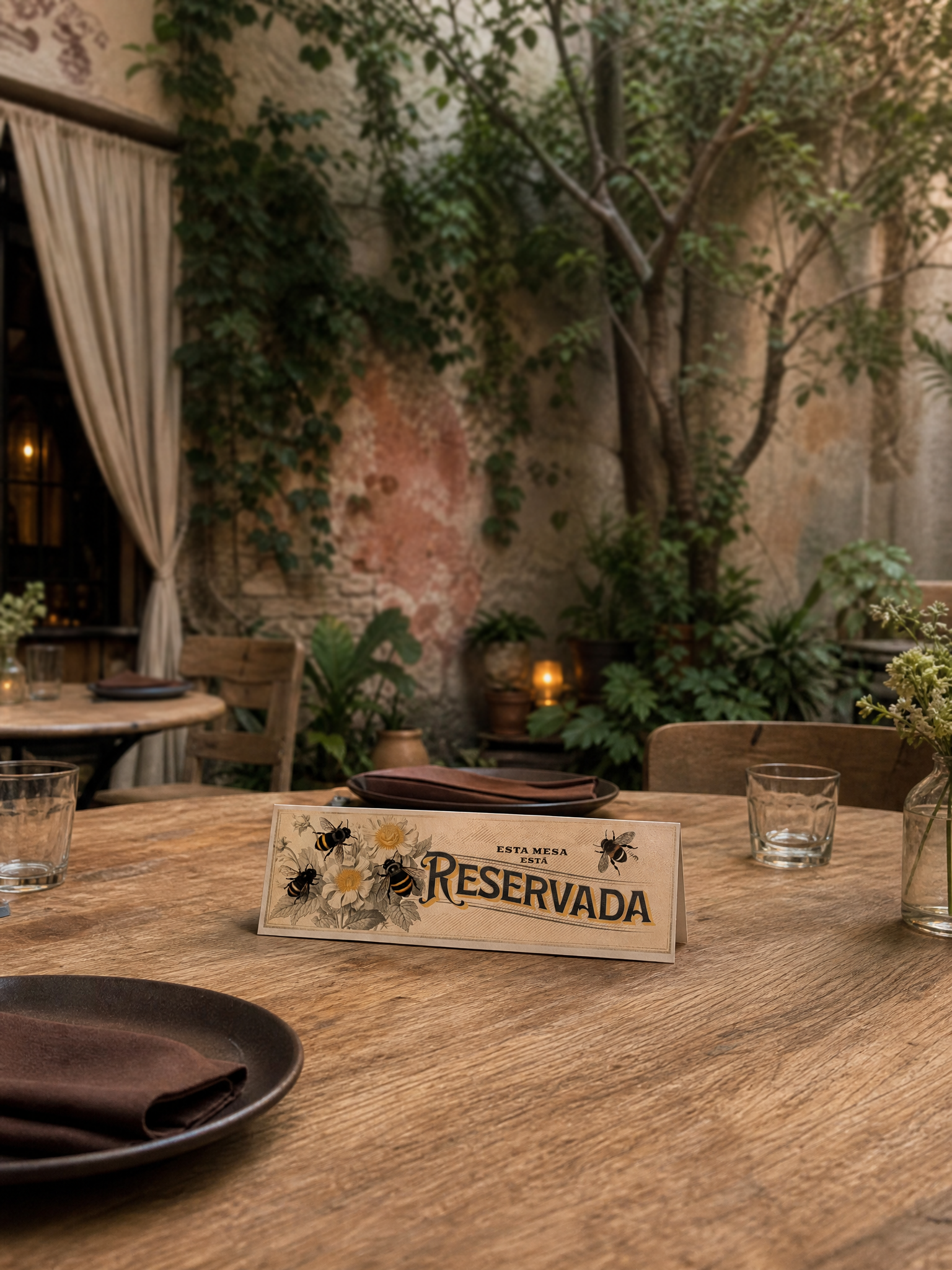
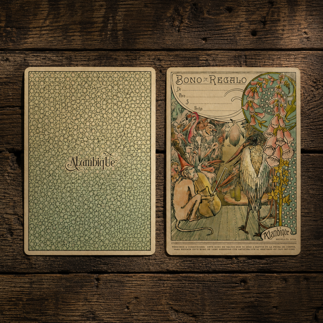
The.....We built a complete visual language around the codes of Colombian popular culture, then refined them just enough for a contemporary hospitality setting. Every touchpoint was treated as part of the same world. Rather than placing the branding only on the obvious moments, we used the small, functional objects like napkins and server’s order note pads to make the experience feel more complete and genuine.
For this client we designed:
Logo
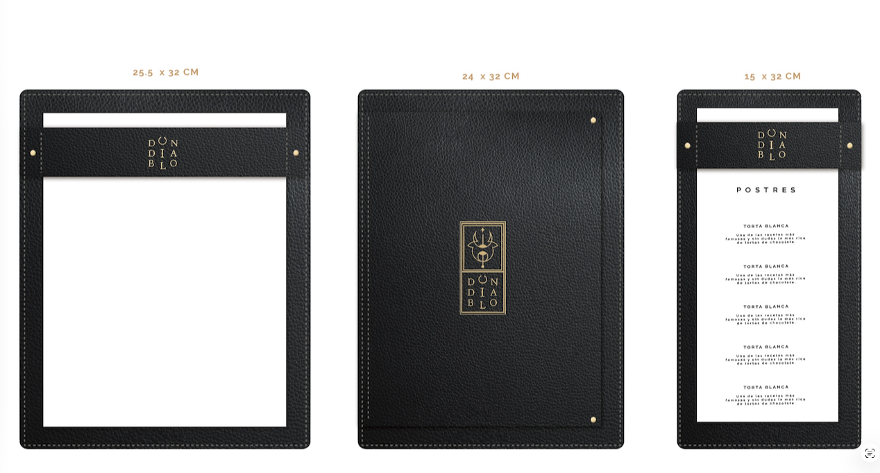
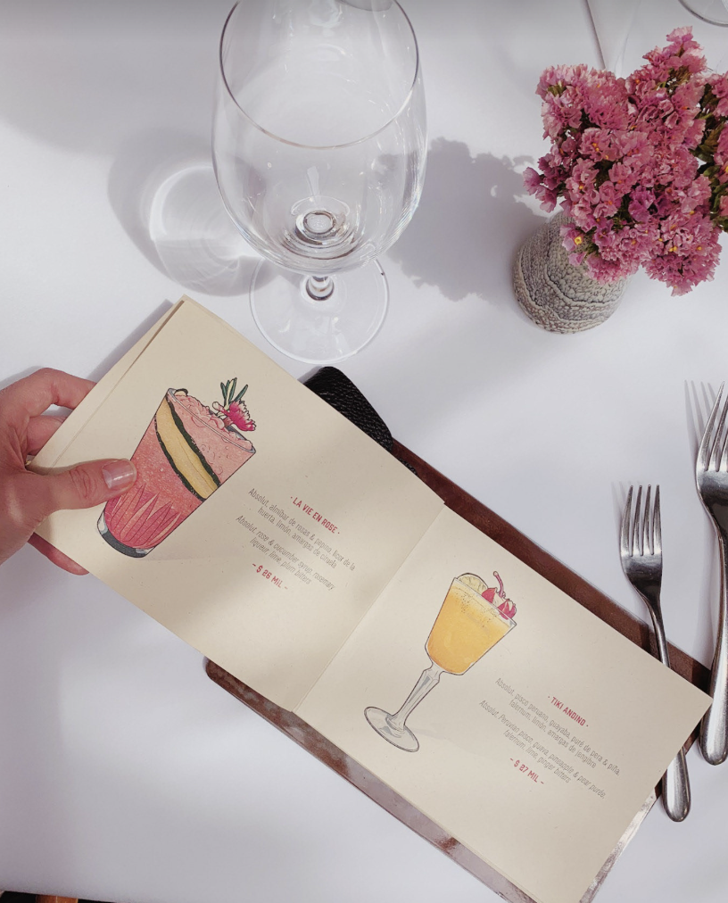
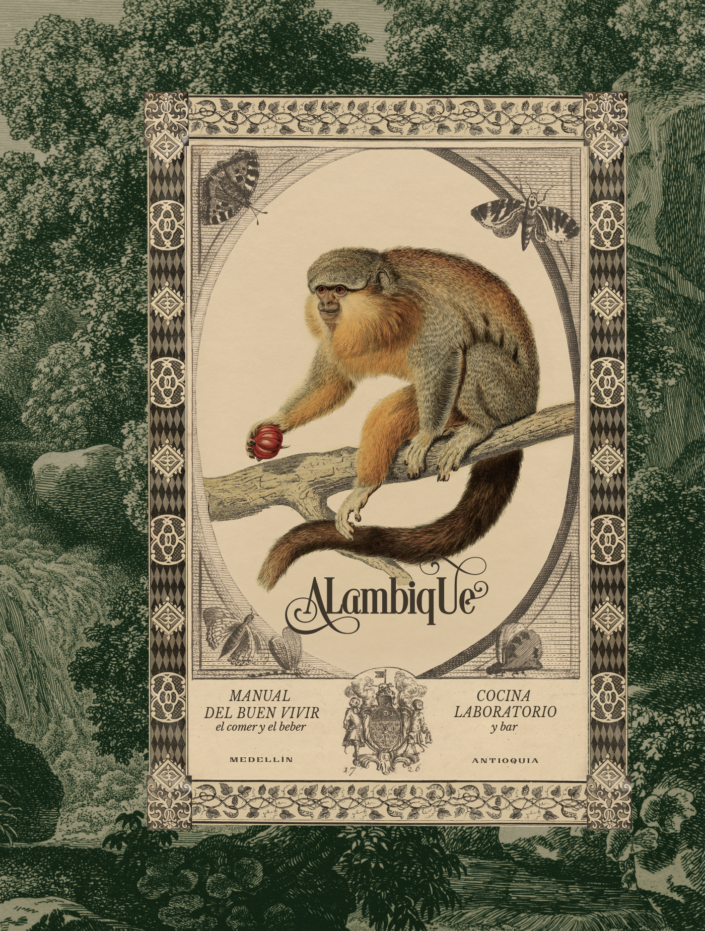
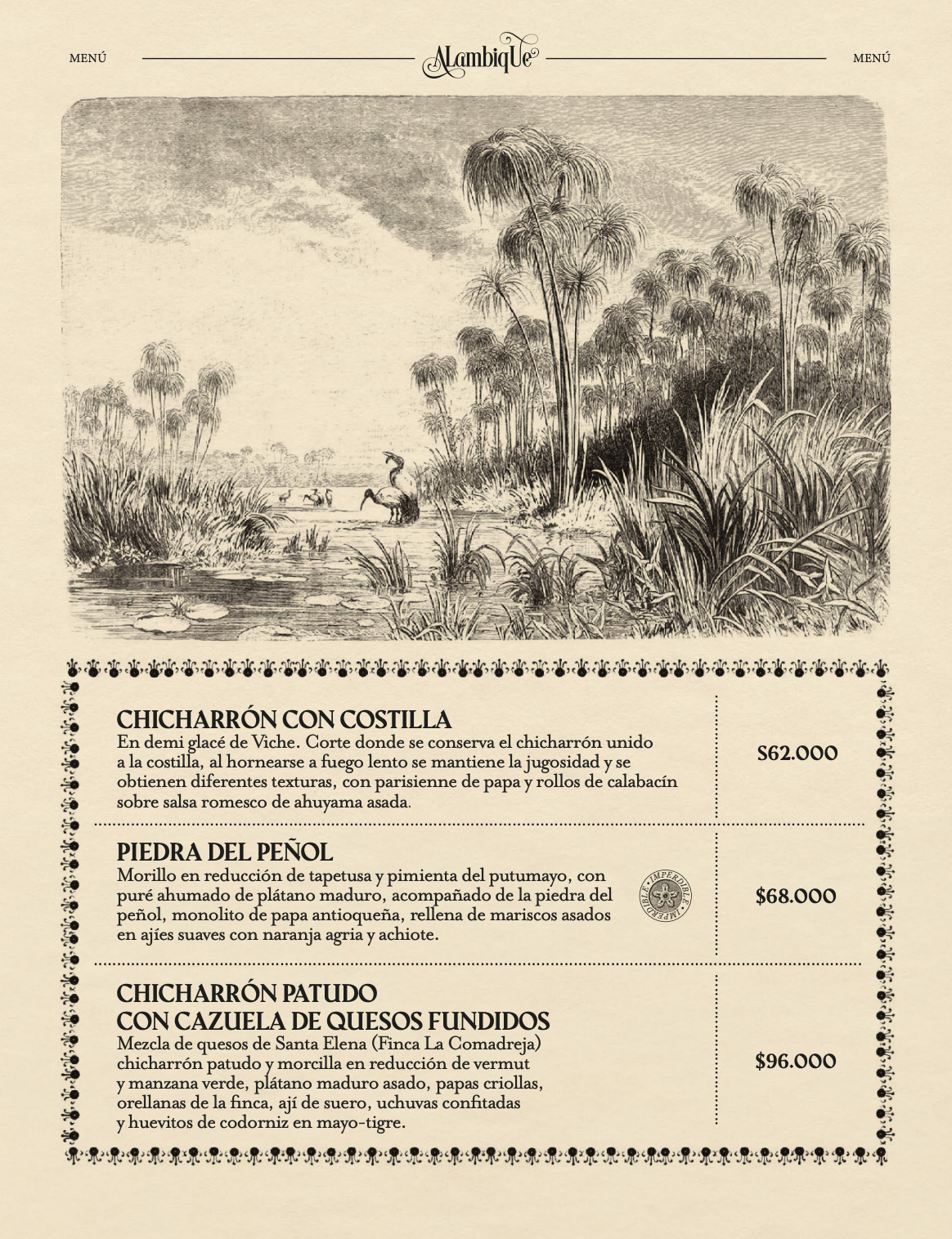
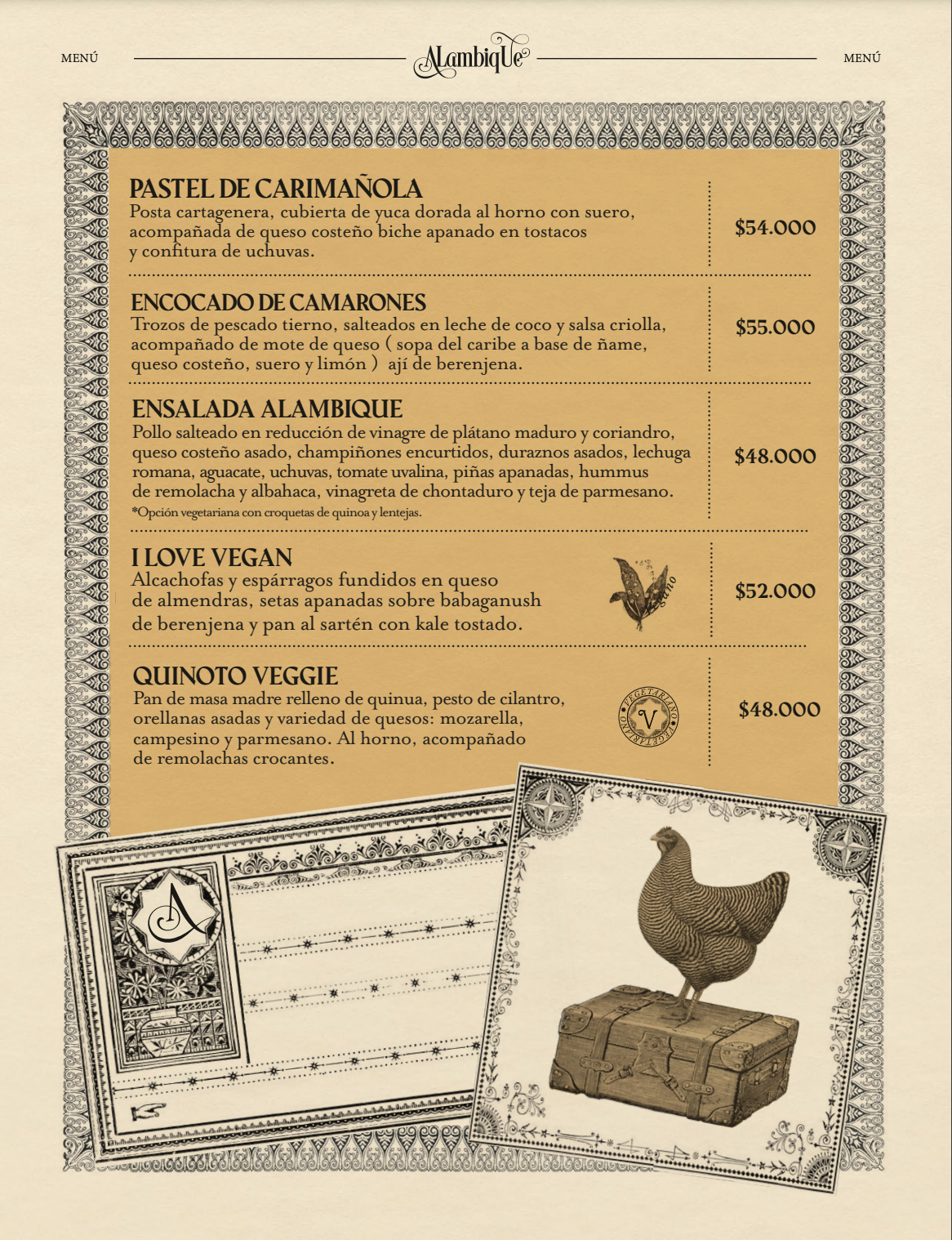
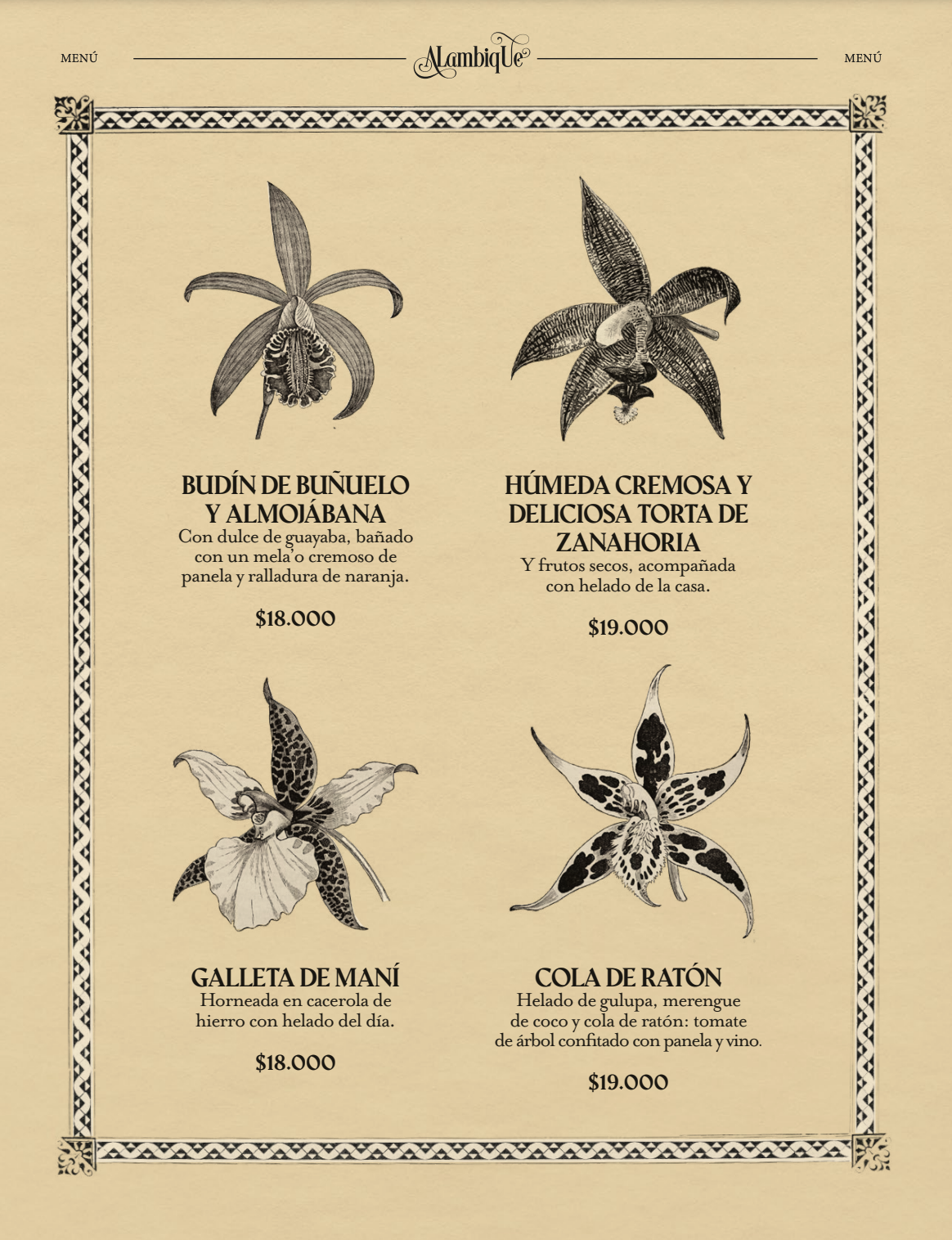
Menus
Packaging
Napkins
Order Pads
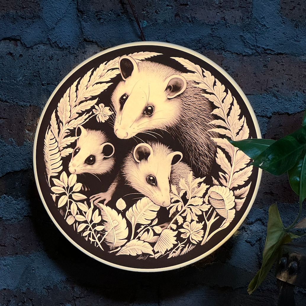
Entrance Light Box
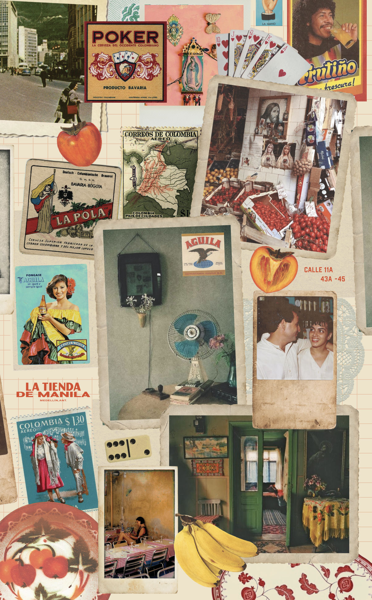
THE INSPIRATION
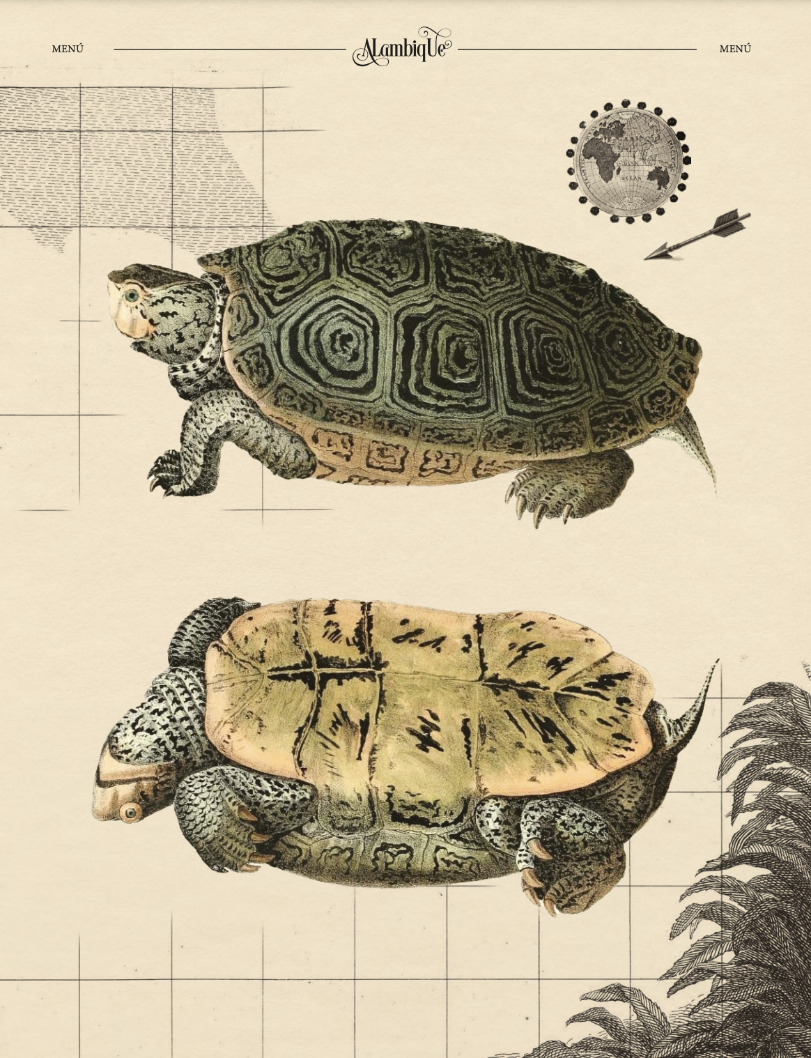
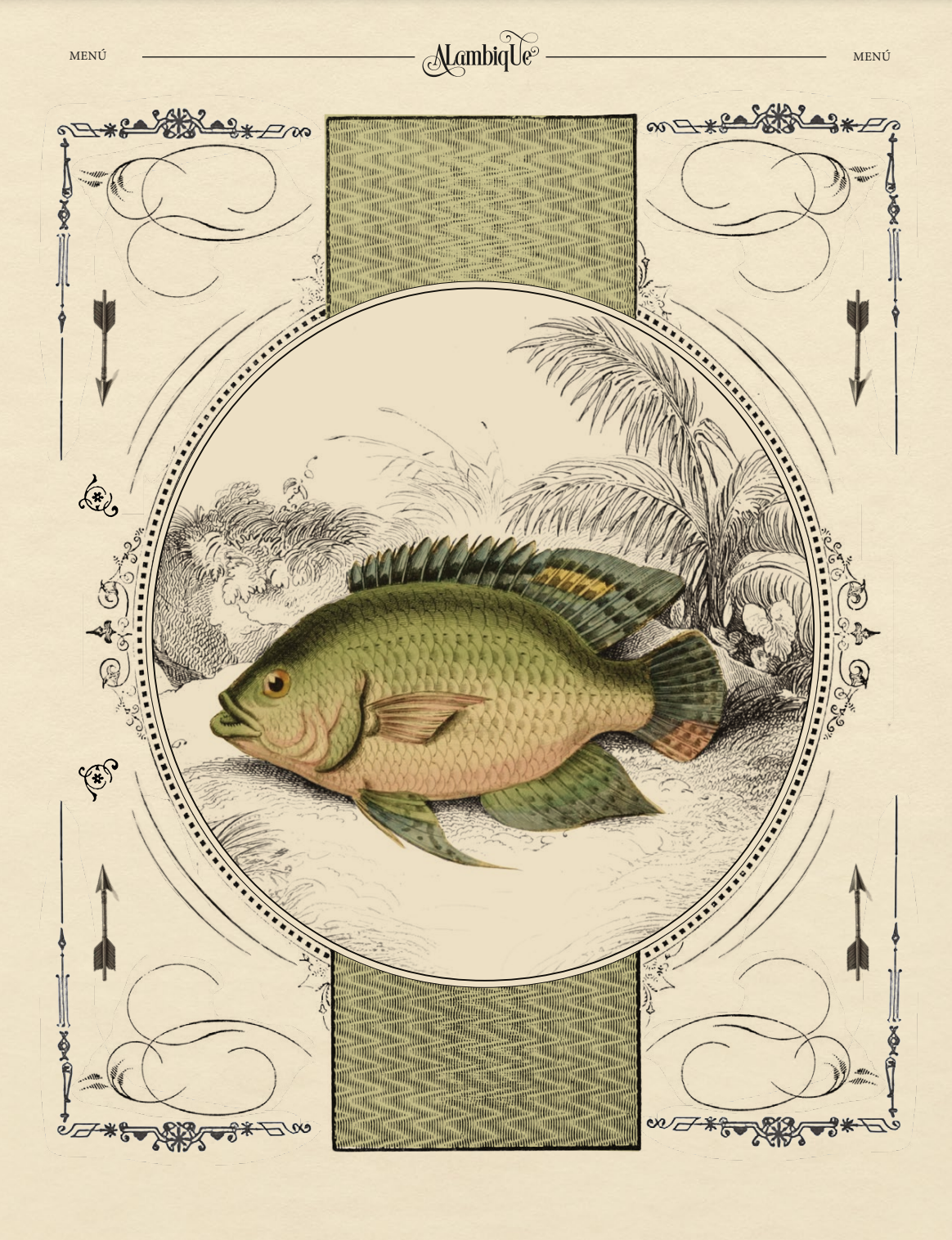
The visual world draws from traditional tiendas de barrio, old Colombian advertising, food packaging, receipts, handwritten order pads, postcards, painted storefronts and the domestic objects that once filled everyday homes and shops. A warm, aged palette of cream, green and red, bold utilitarian typography and layers of familiar imagery give the identity the feeling of something collected over time rather than designed all at once.
The goal was never to reproduce a specific era, but to capture the emotion behind it — a more local, abundant and unhurried way of gathering.
THE PROCESS
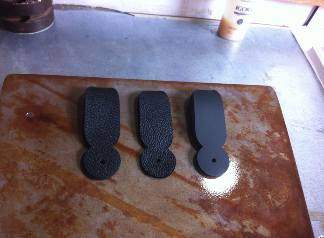
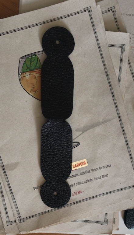
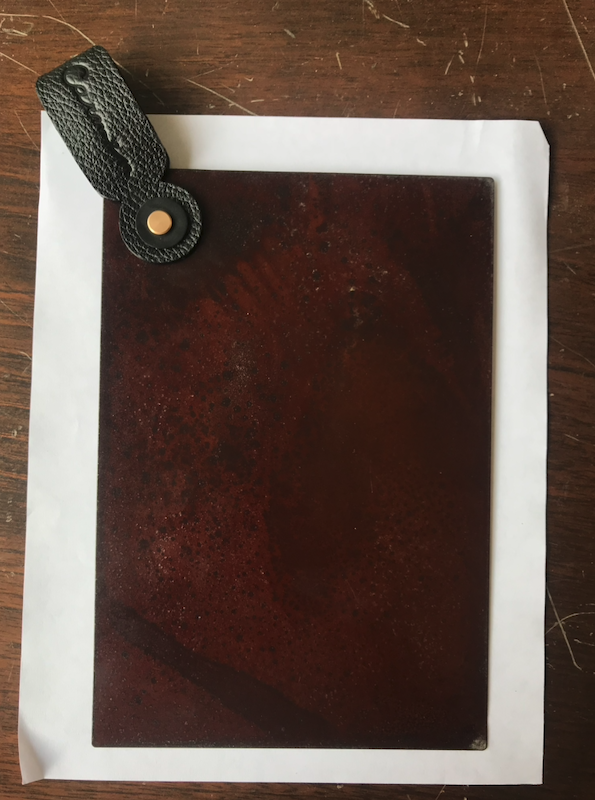
THE RESULT
“———-”
Gift Certificates
Lightboxes
THE IMPACT
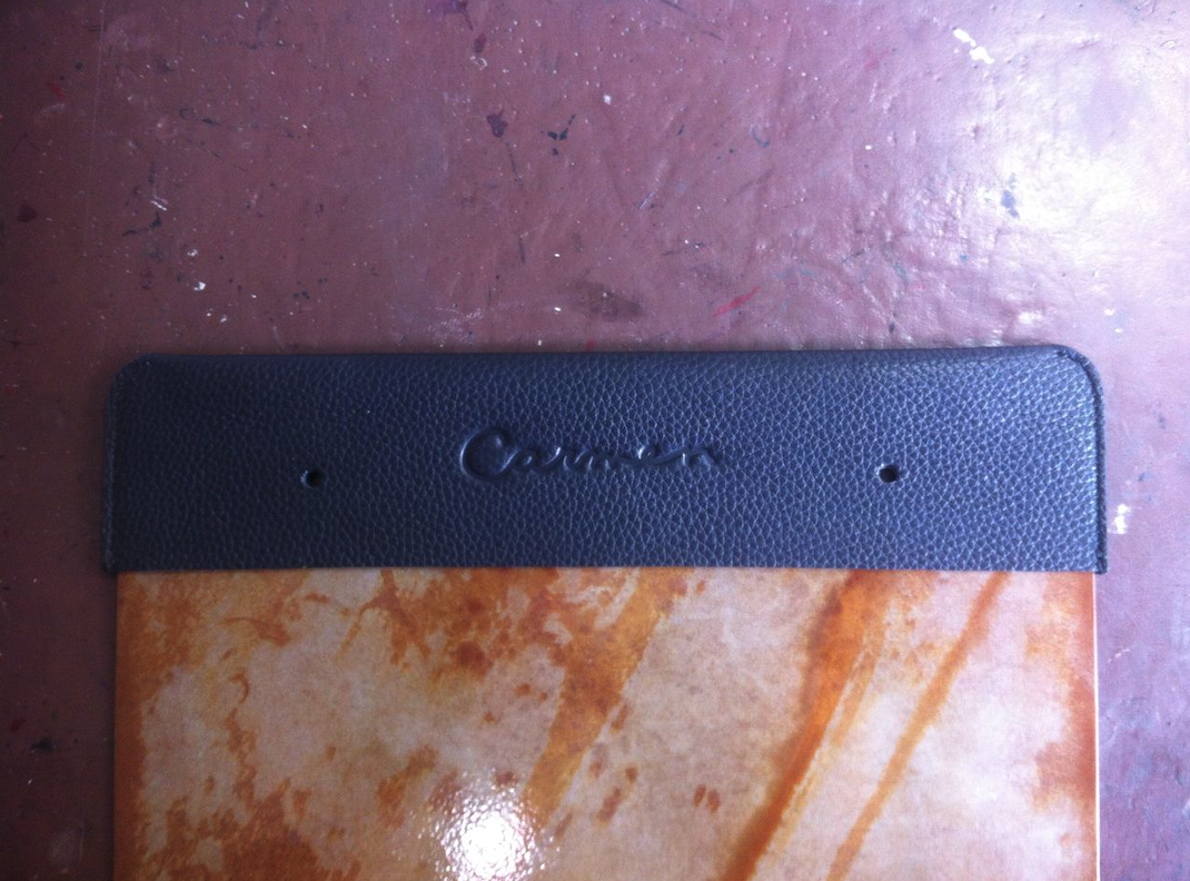
A las.........The result is an identity that makes a completely new place feel immediately familiar. Every touchpoint contributes to the same story, turning menus, packaging and service objects into part of the atmosphere rather than simply branded collateral.
A concept created from scratch, with the familiarity of a place that feels like it has been there for generations.