

Alambique
A familiar restaurant building a richer a unified language for its next chapter.
Alambique is a Colombian restaurant and bar rooted in local ingredients, experimentation and a universe of botany, natural history and storytelling.
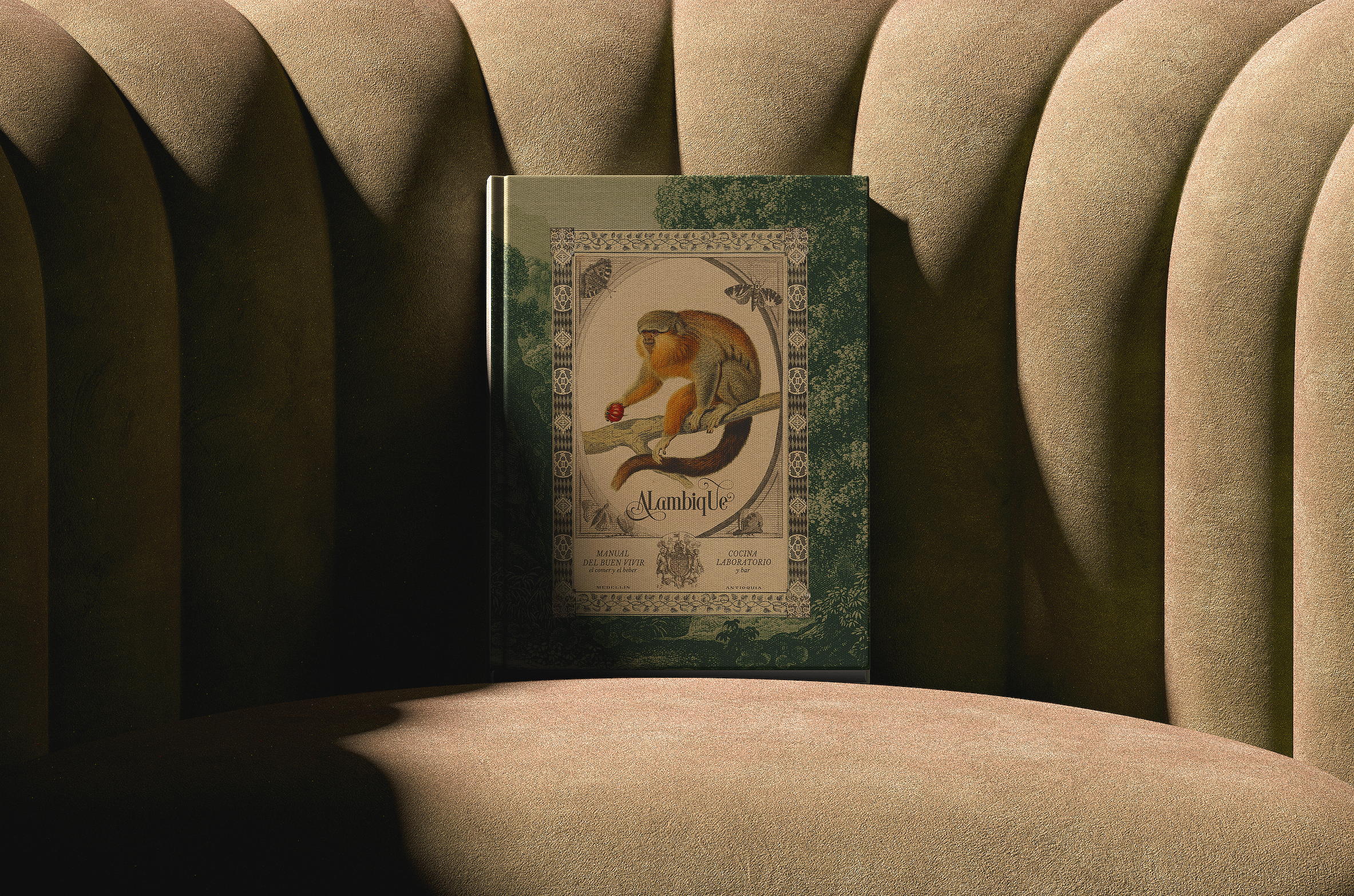
LOCATION:YEAR:MEDELLÍN, COLOMBIA2023RESTAURANT & BARVENUE TYPE:AREAS OF WORK:BRAND / SPACECUSTOM ILLUSTRATIONSMENU DESIGNUNIFORMSLIGHTBOXESGIFT CERTIFICATESPOSTCARDSRESERVATIONS TENTRECRUITMENT MATERIALSA restaurant with a loyal following and a strong universe.
/ CONTEXT
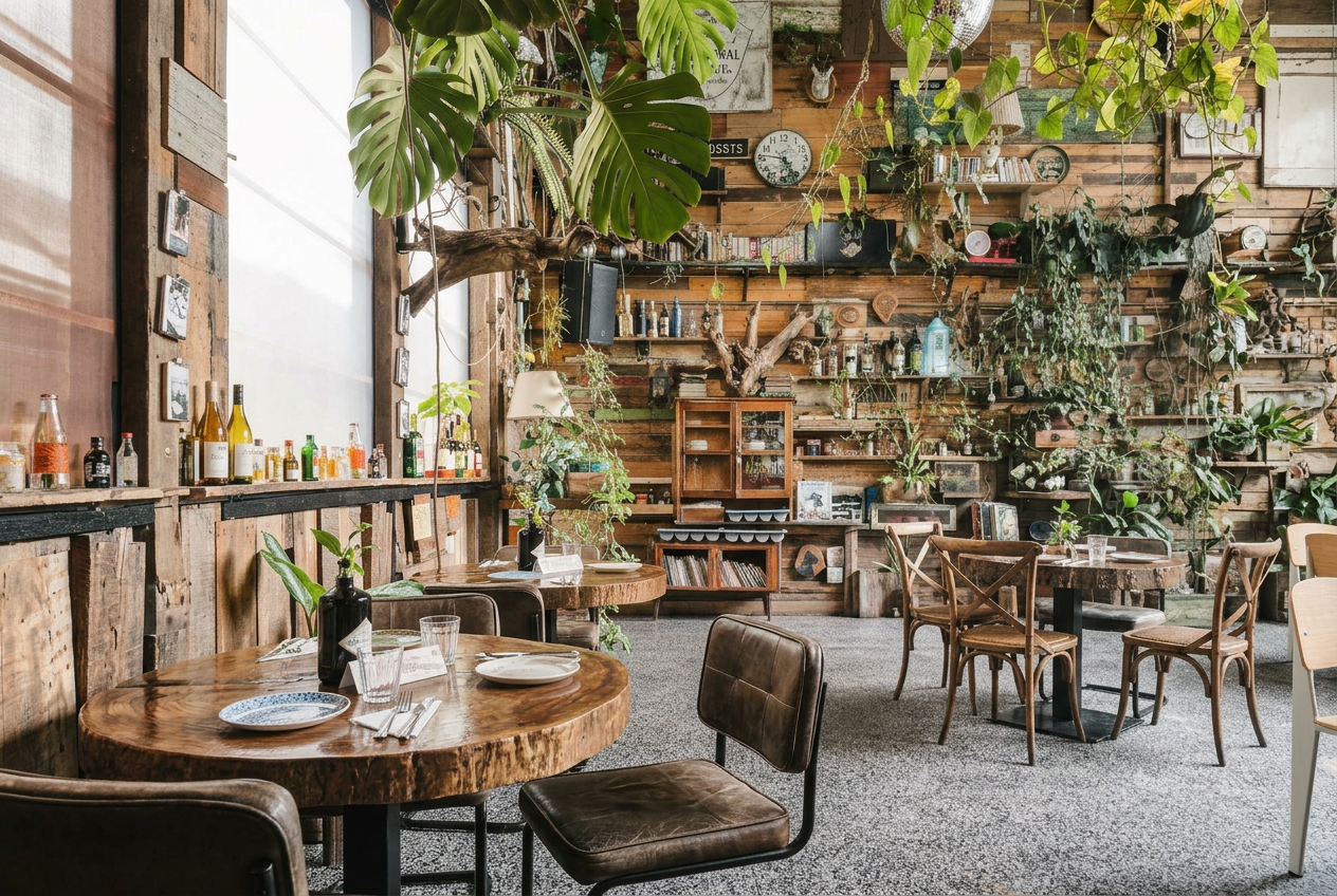
For more than a decade, Alambique had built a loyal following around its food, atmosphere and distinctive bohemian character. Its world was already familiar to the people who returned to it.
Botany and storytelling offered a foundation for the next chapter. The work began with the personality the restaurant had already built.
The restaurant was growing fast and its visual system needed to grow with it.
/ OPPORTUNITY
Alambique already had a distinctive identity and a successful new location. But as the restaurant grew, new design needs were being handled by different freelancers, and the pieces were starting to feel disconnected.
The opportunity wasn’t to reinvent the brand. It was to bring the creative direction under one vision — building a more cohesive visual universe that could support Alambique as it continued to grow.
/ OUR APPROACH
Keep what worked. Expand the world around it.
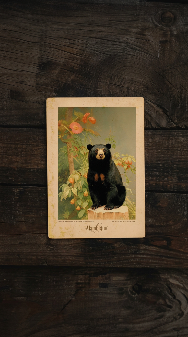
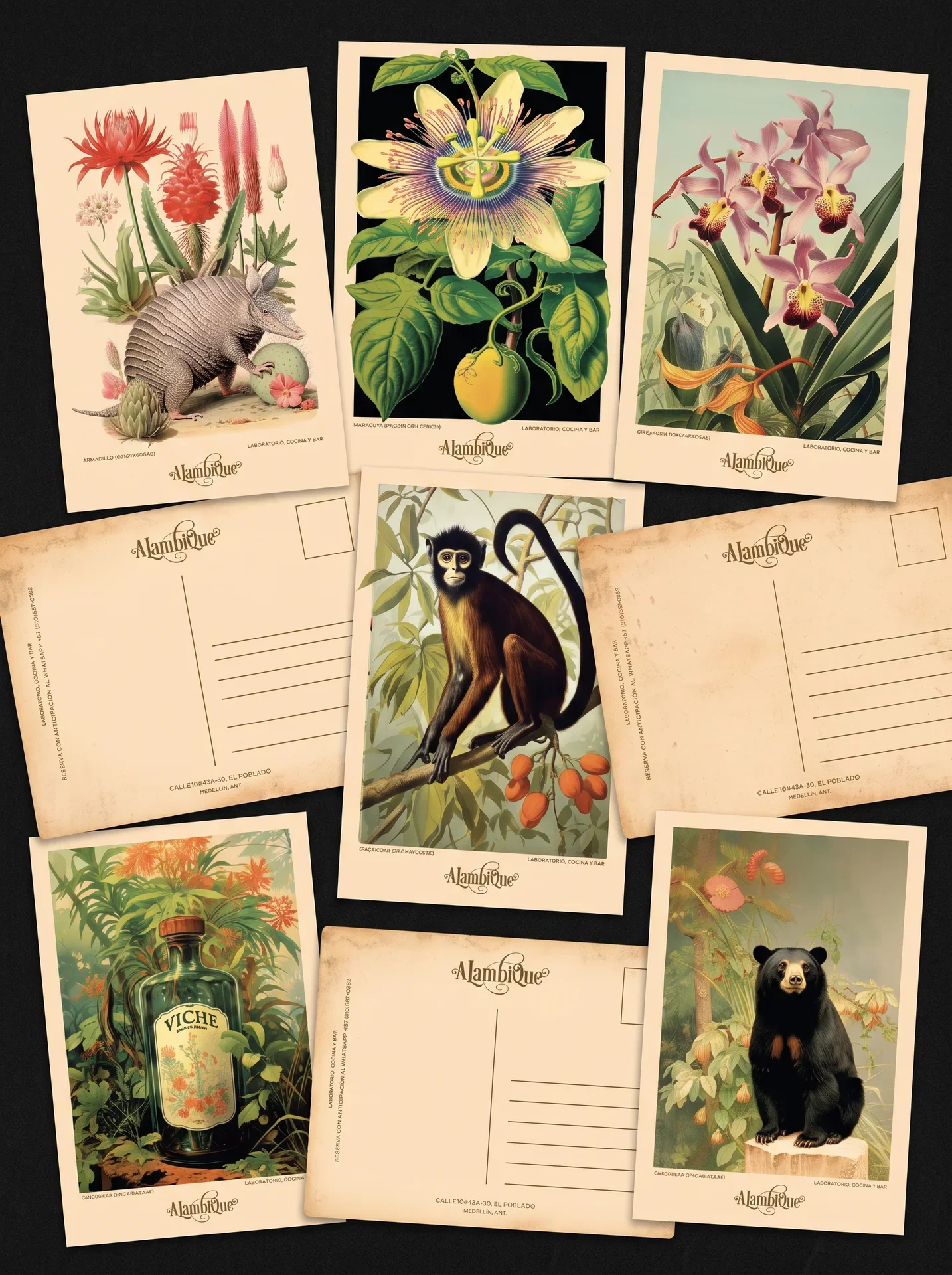
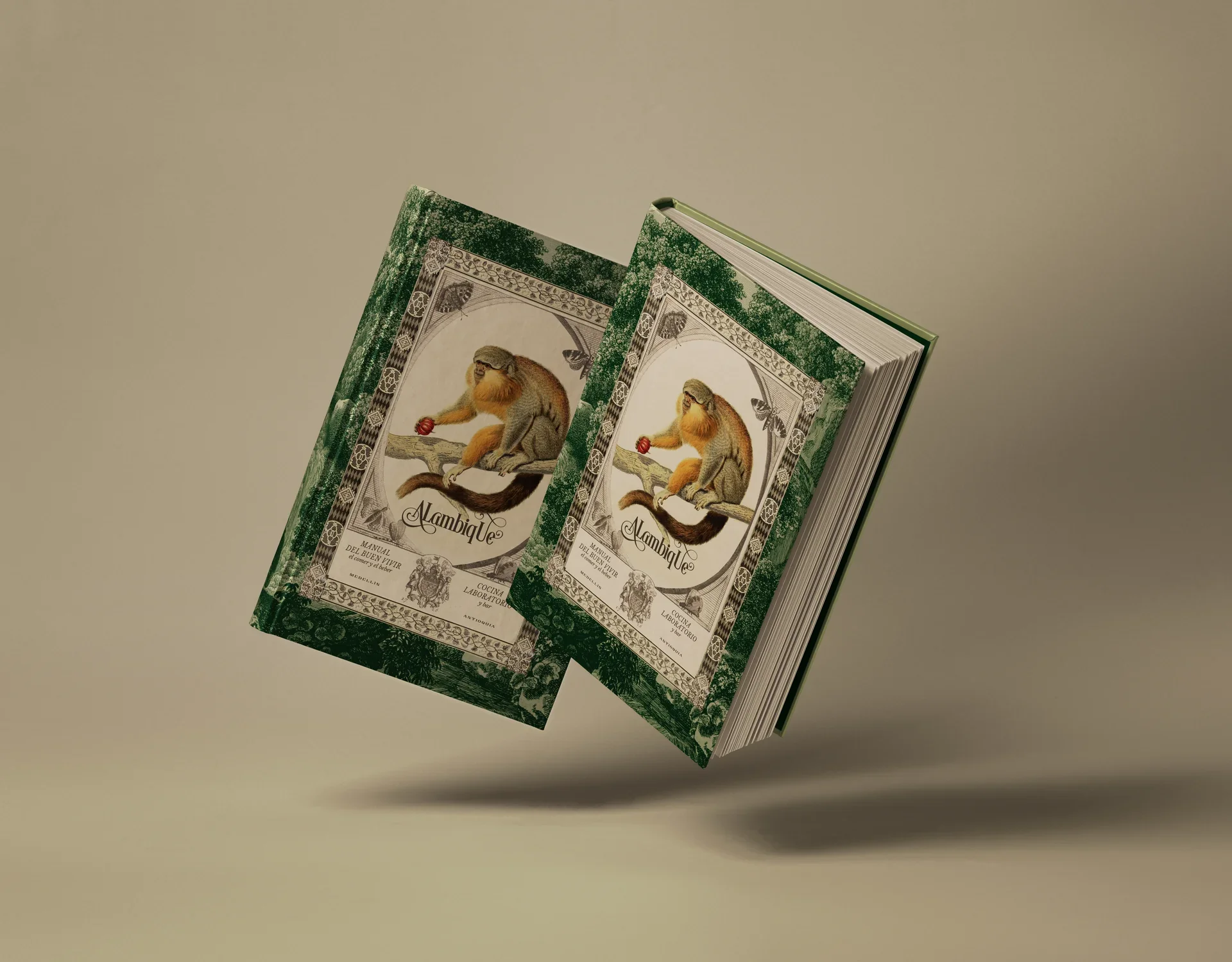
We kept Alambique’s bohemian, vintage spirit and built a richer visual language around it, drawing from magical realism, botanical studies, alchemy, and Colombia’s flora, fauna and landscapes. The result is a more cohesive universe that can keep evolving across menus, products, interiors and future brand moments.
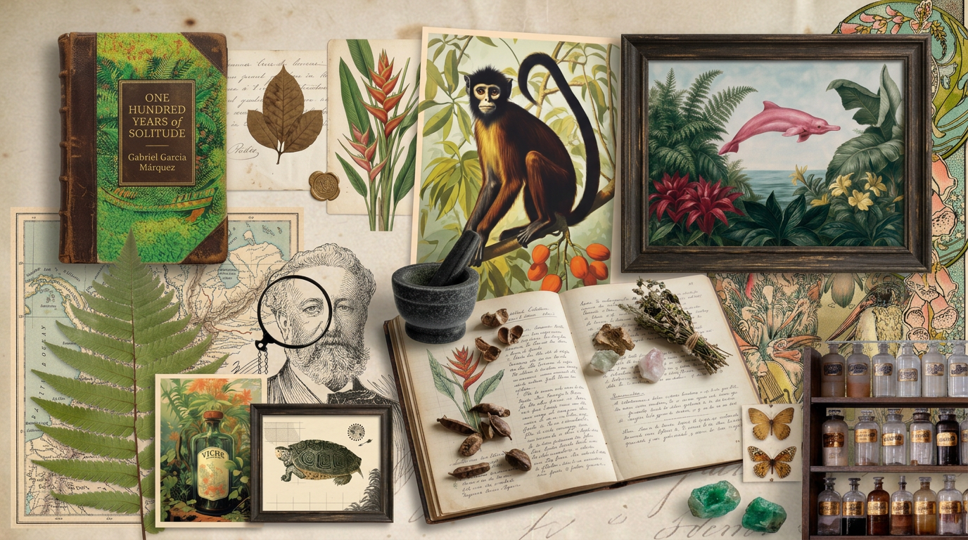
A visual language built from curiosity.
/ VISUAL WORLD
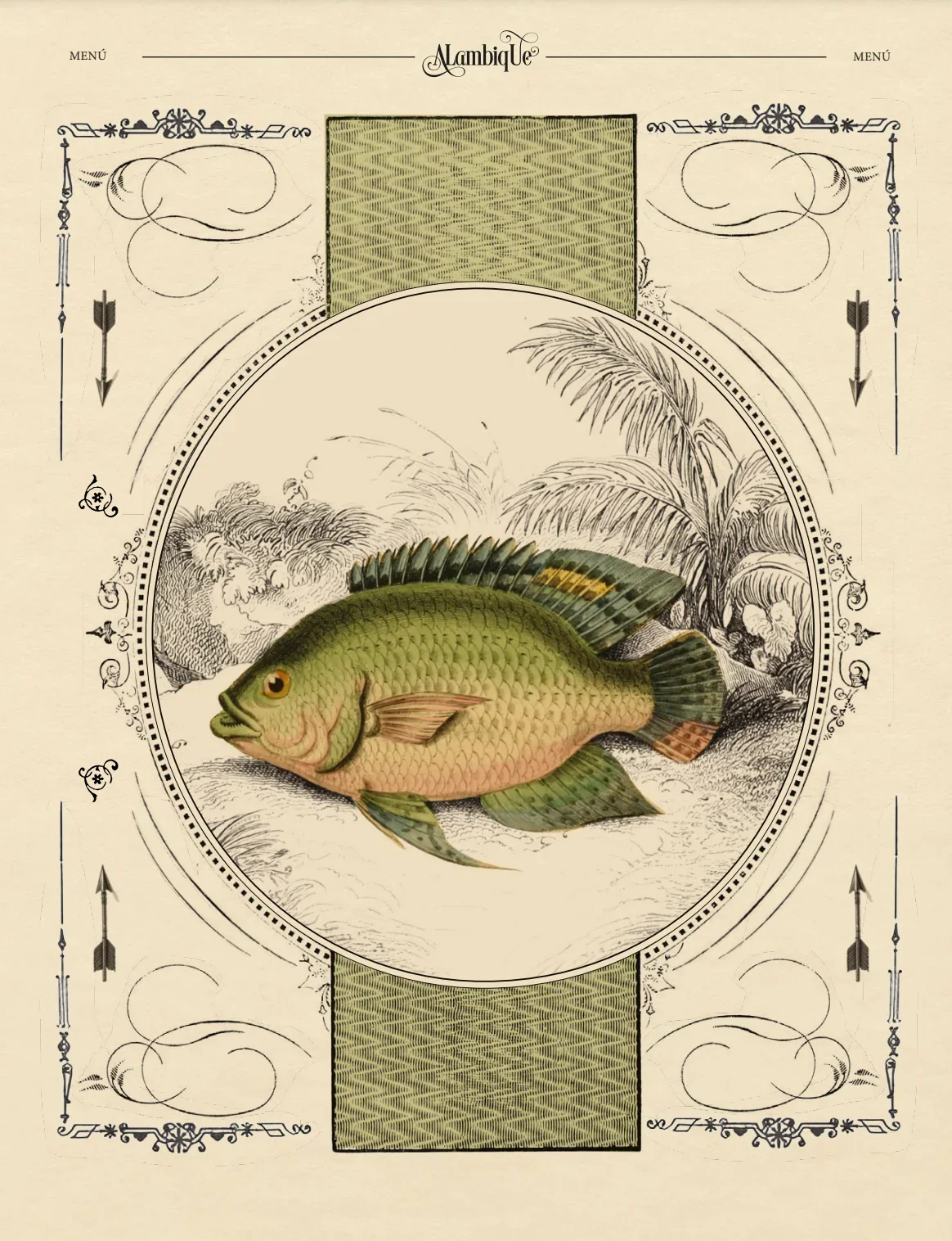
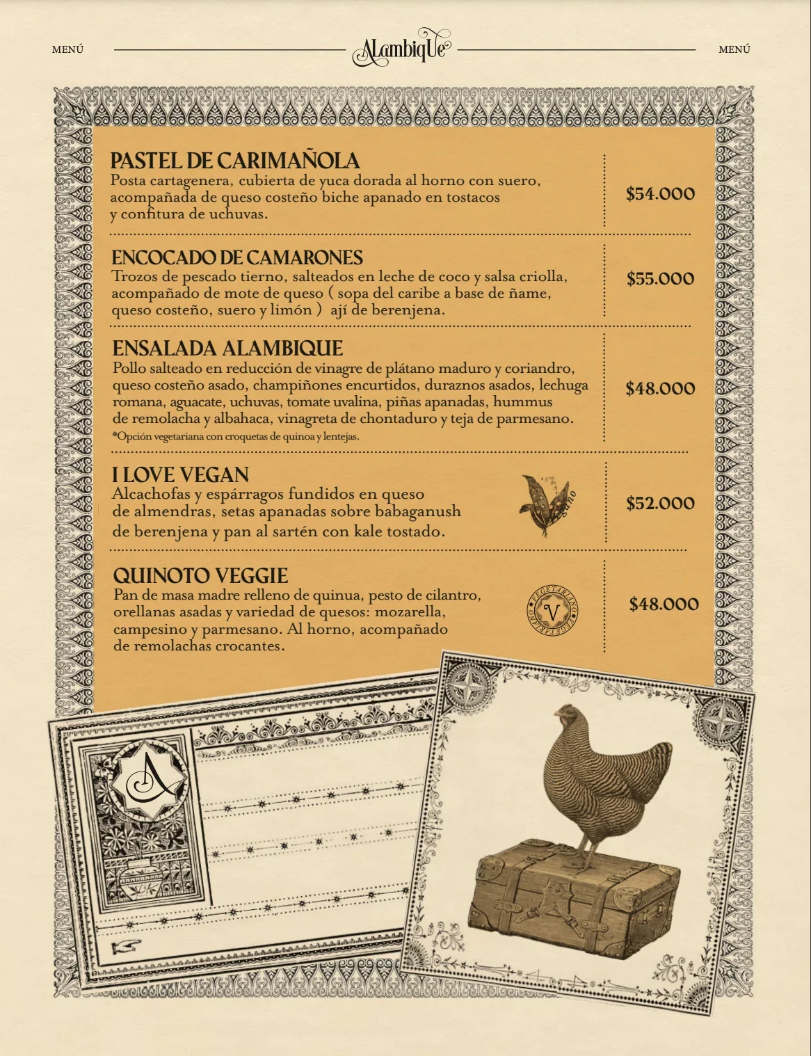
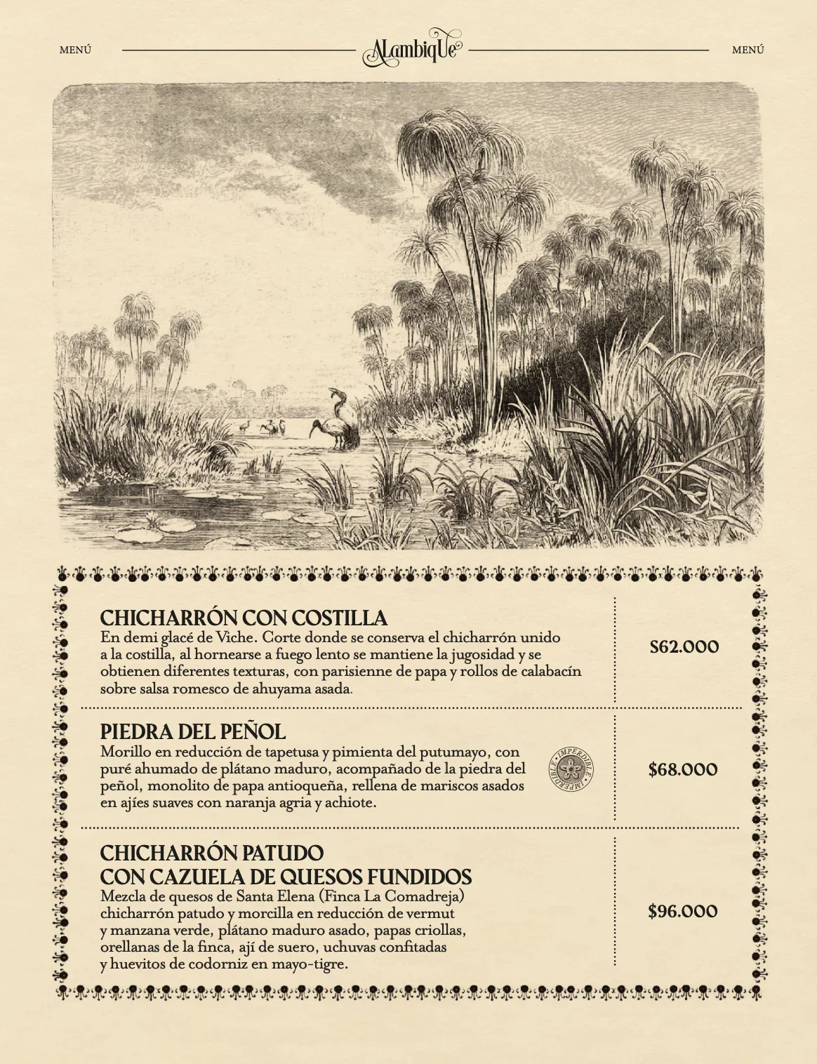
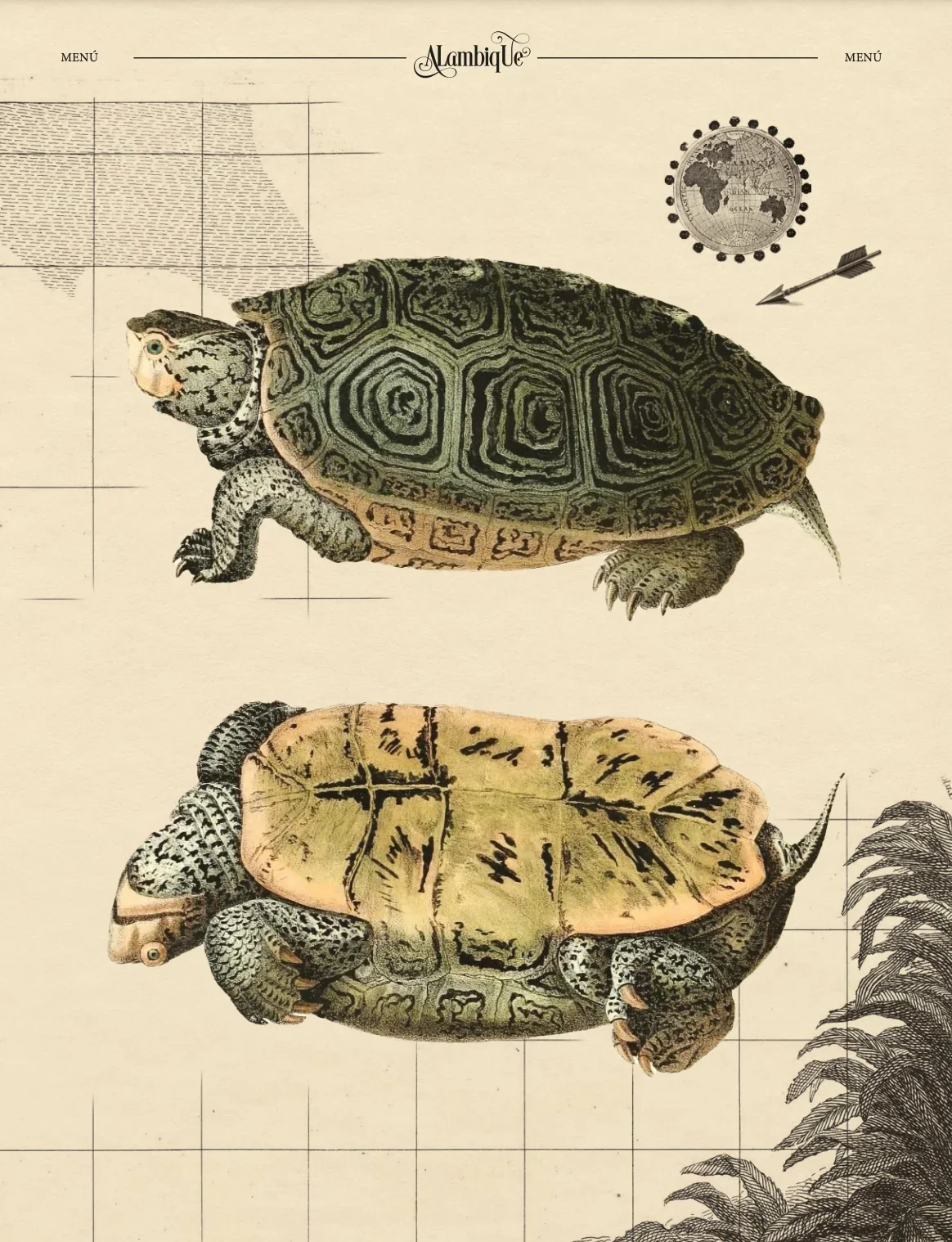
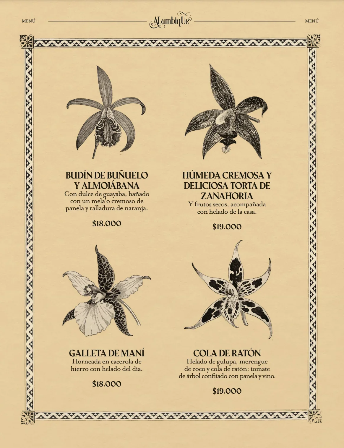
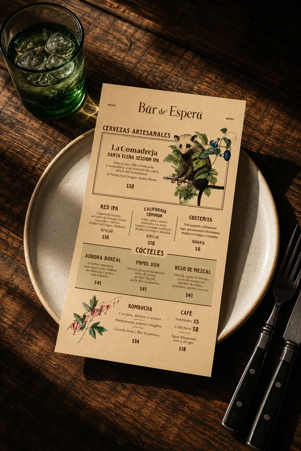
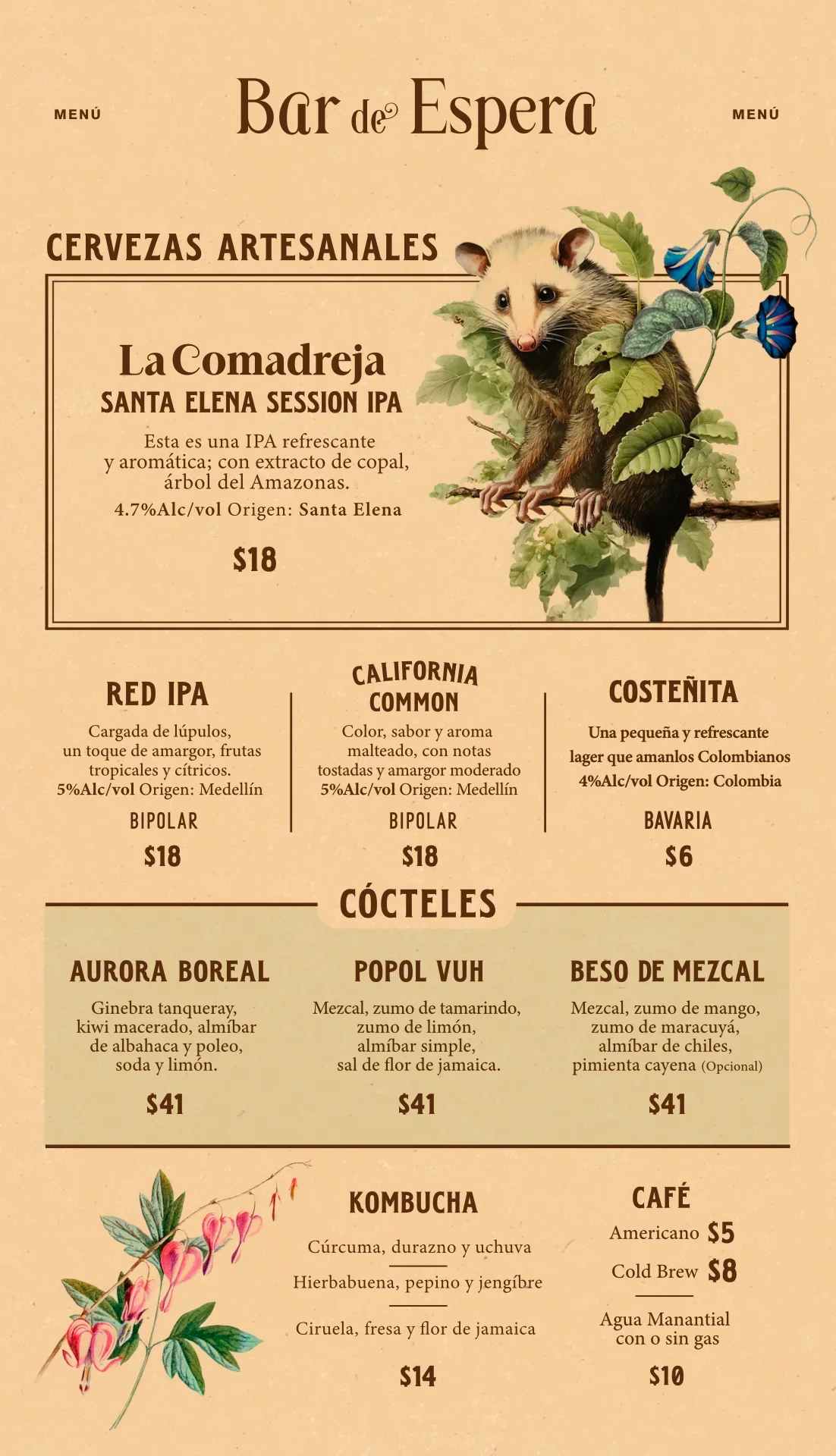
Botany, alchemy, magical realism and Colombian culture came together through custom illustration, creating a recognizable visual language that could live across the entire Alambique experience.
The Food and Drink Menus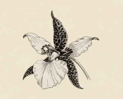
BEYOND THE MENU
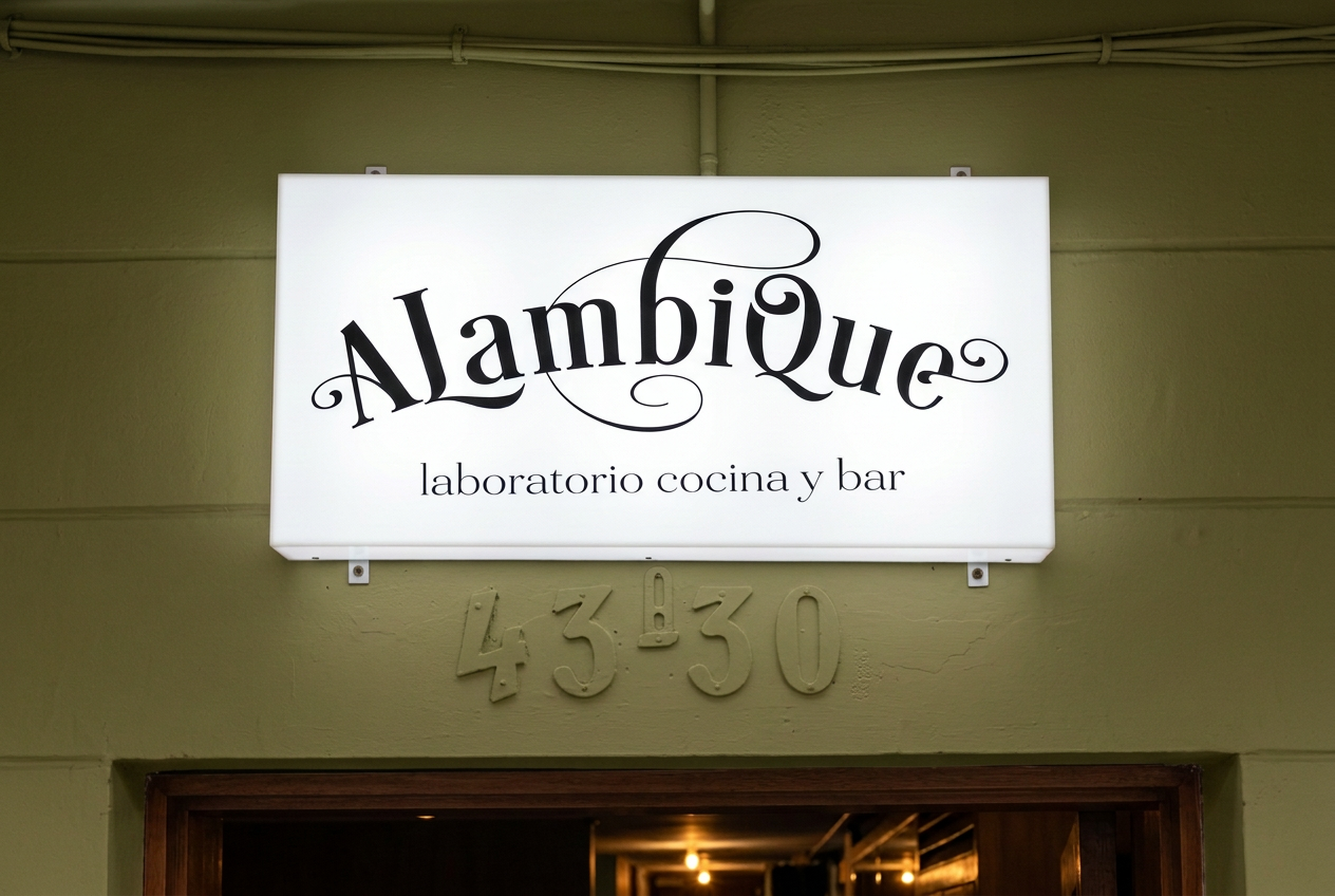
The same visual world extended across uniforms, lightboxes, postcards, gift certificates and recruitment materials. Each application gave the language a different role in the restaurant’s experience.
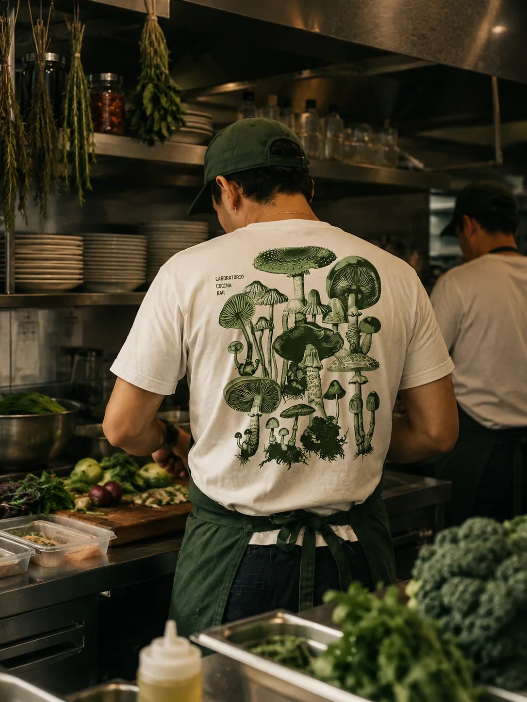
The Staff T-Shirt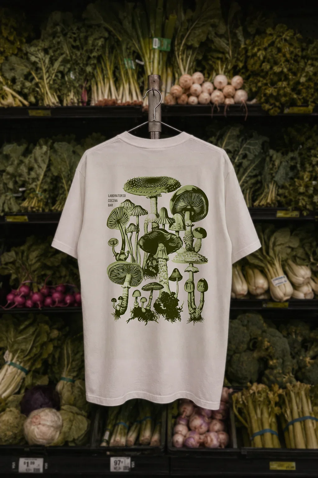
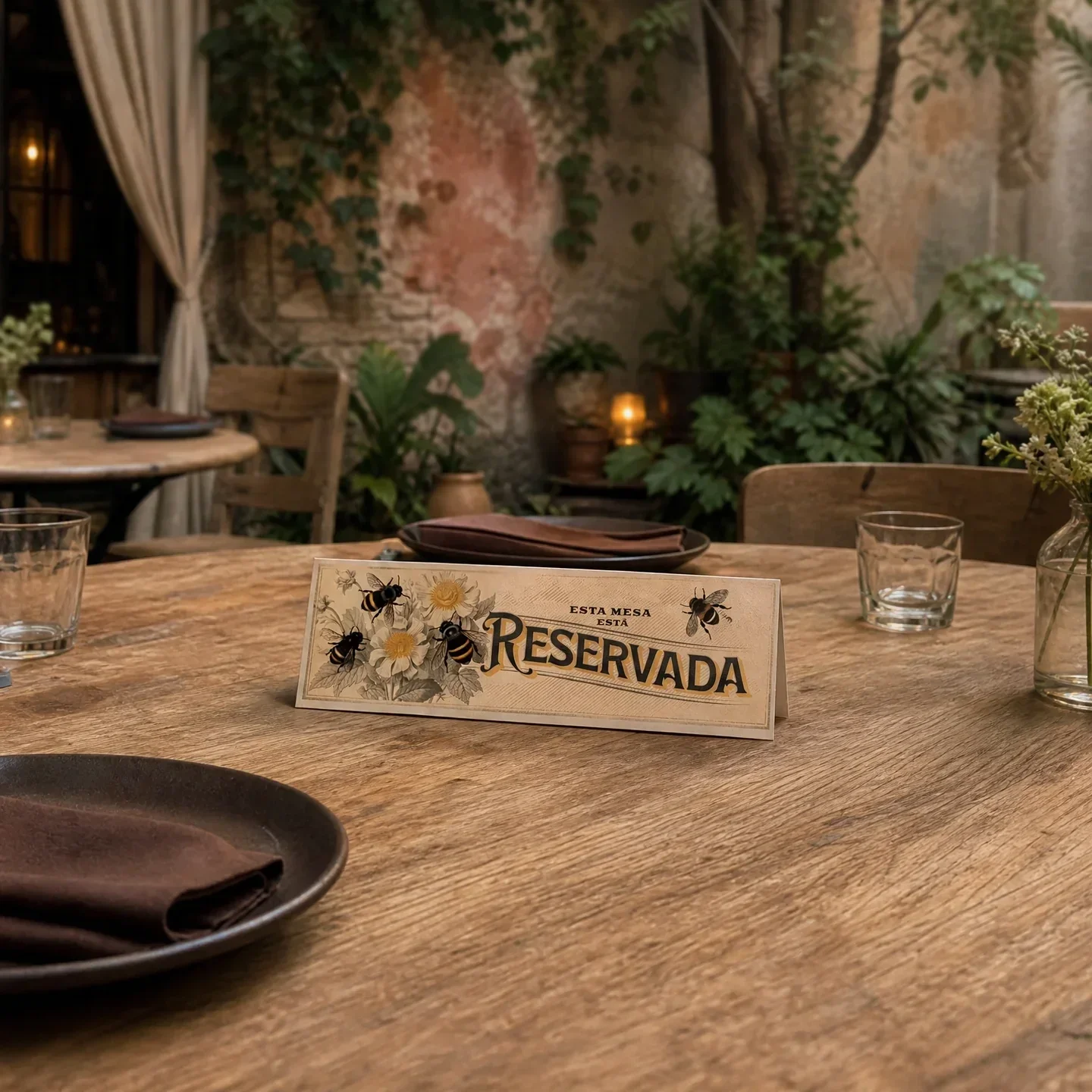
The Reserved Table Tent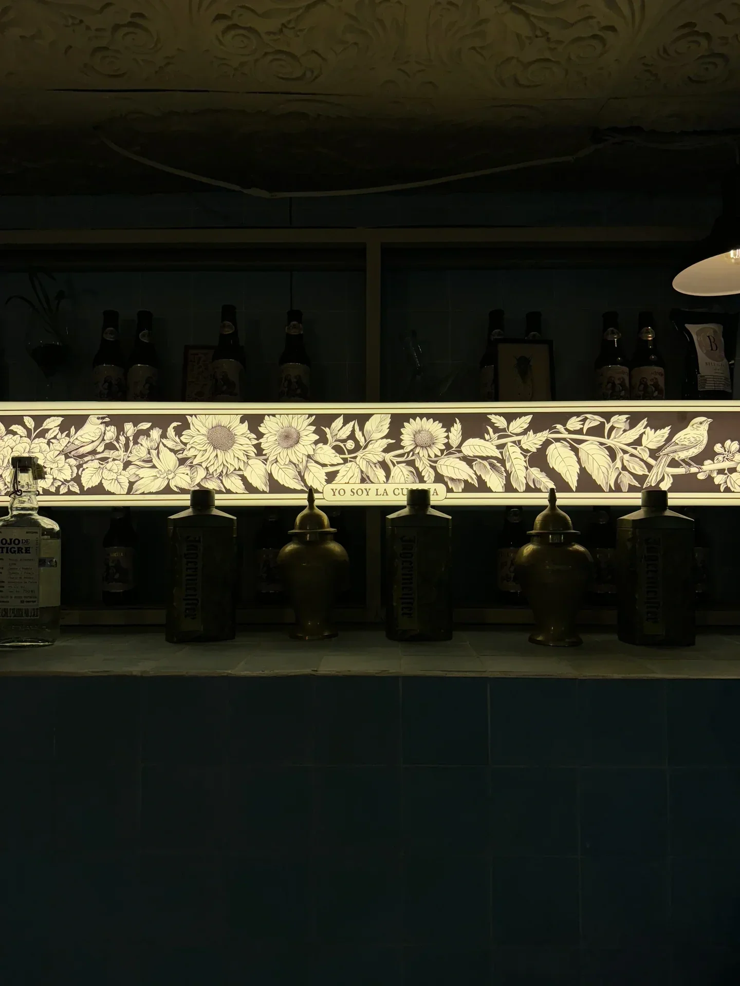
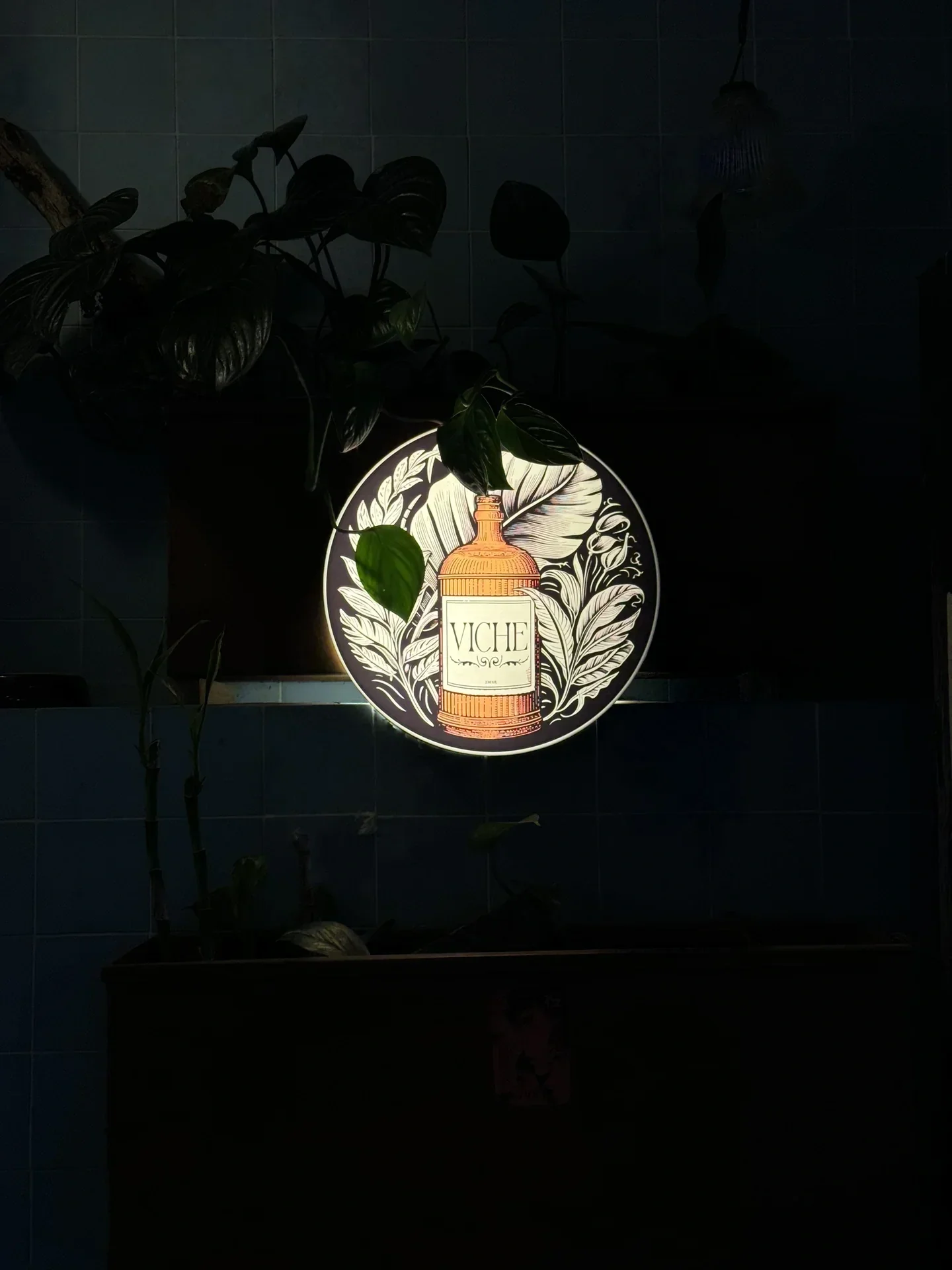
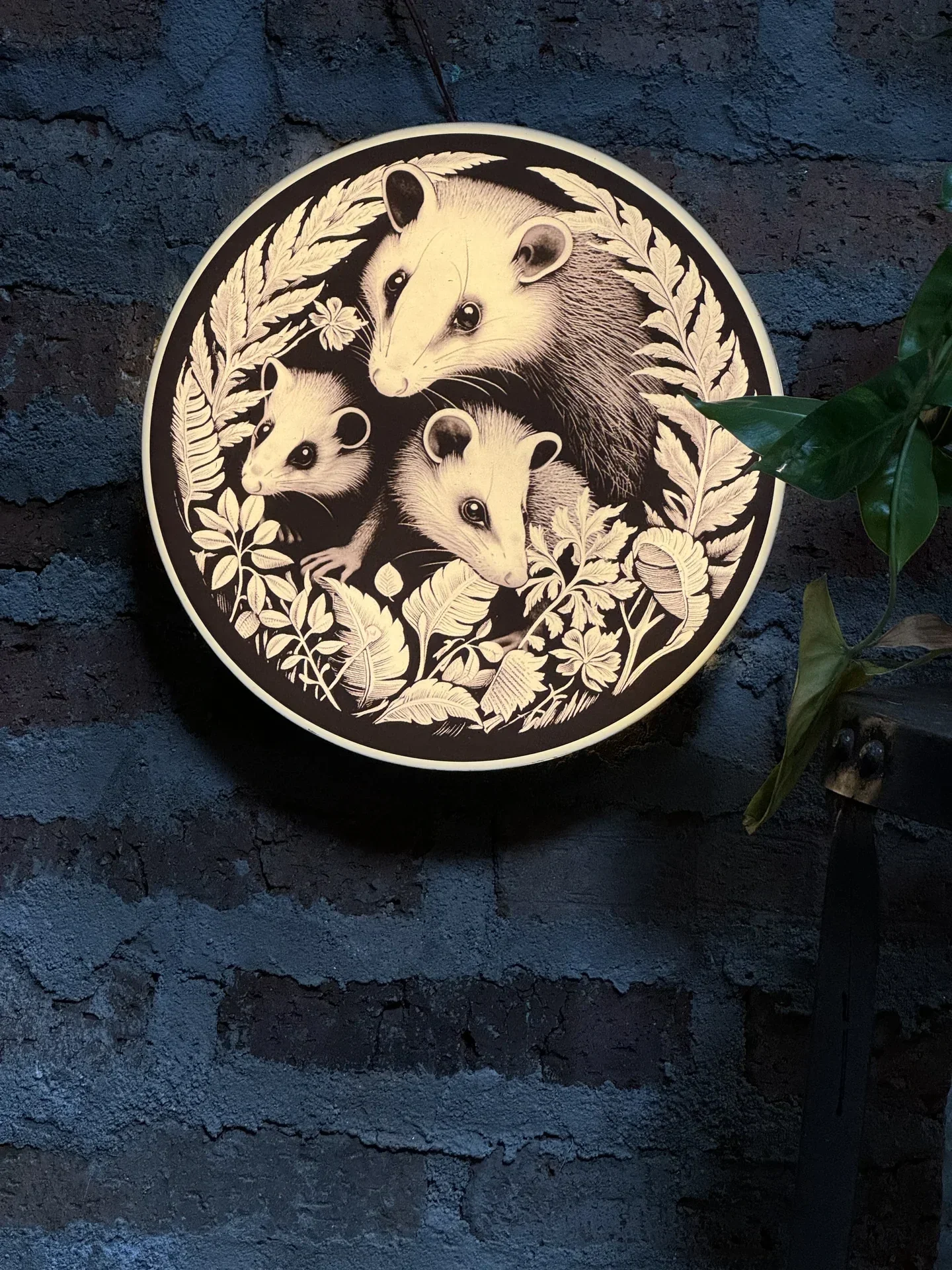
Lightboxes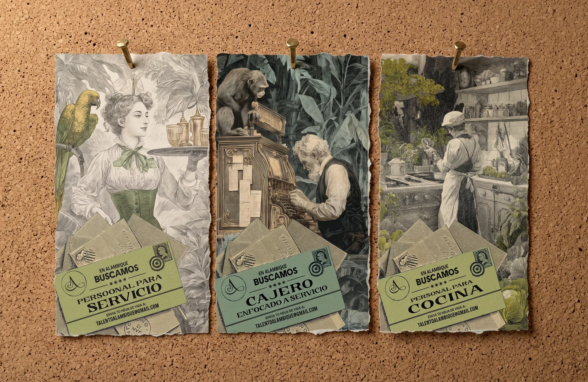
Recruitment Signs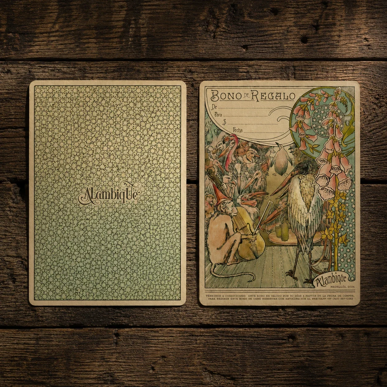
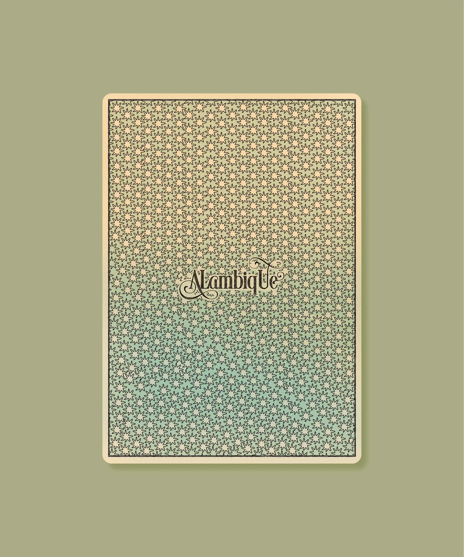
Gift Certificates/ OUTCOME
A stronger brand, ready to grow without losing what made it special
The new visual direction gave Alambique one shared language to build from, so menus, products, interiors and future materials could feel connected instead of designed separately. As the restaurant grows, the brand now has a stronger foundation to grow with it.