

La Tienda de Manila
A new bar built around the familiarity of an old neighborhood corner store.
La Tienda de Manila is a contemporary take on the traditional neighborhood tienda — part corner store, part local gathering place. Built around shared food, drinks and easygoing hospitality, the concept brings the warmth, humor and visual memory of an older everyday culture into a new setting.
LOCATION:YEAR:MEDELLÍN, COLOMBIA2025LOGOVENUE TYPE:AREAS OF WORK:RESTAURANT & BARBRANDPACKAGINGMENU DESIGNLIGHTBOXESNAPKINSORDER PADSLIGHTBOXSTICKERS/ CONTEXT
A new place inspired by a more familiar way of gathering.
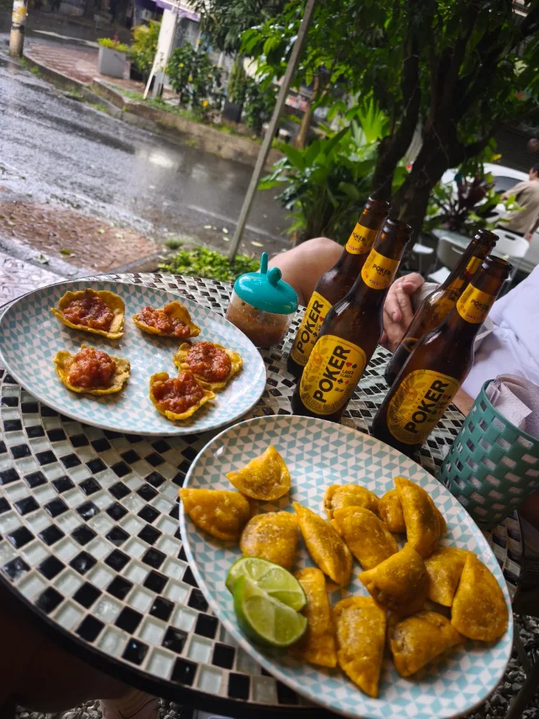
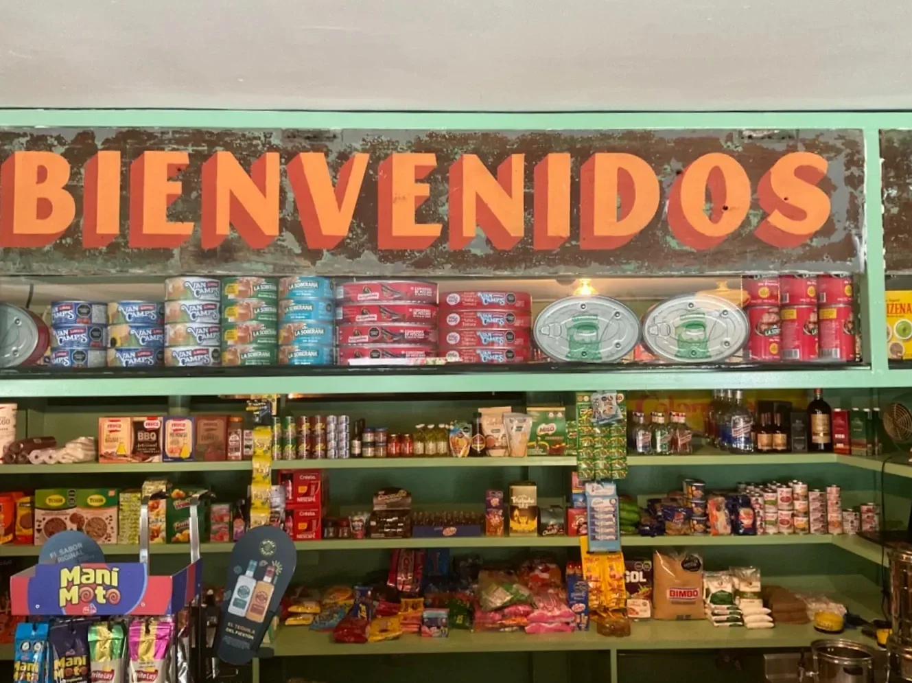
La Tienda de Manila reimagines the neighborhood corner store as a place to eat, drink and linger. Set in one of Medellín’s more polished social districts, the concept looks back to the informal rituals, familiar objects and everyday spaces that once made local gathering feel simple and effortless.
/ OPPORTUNITY
Make something new feel instantly familiar.
The challenge was to create a brand from scratch that could feel nostalgic without becoming a replica of the past. It needed the spontaneity and charm of a neighborhood bodega, while still feeling thoughtful enough for a contemporary bar.
/ OUR APPROACH
Build the brand into the everyday details.
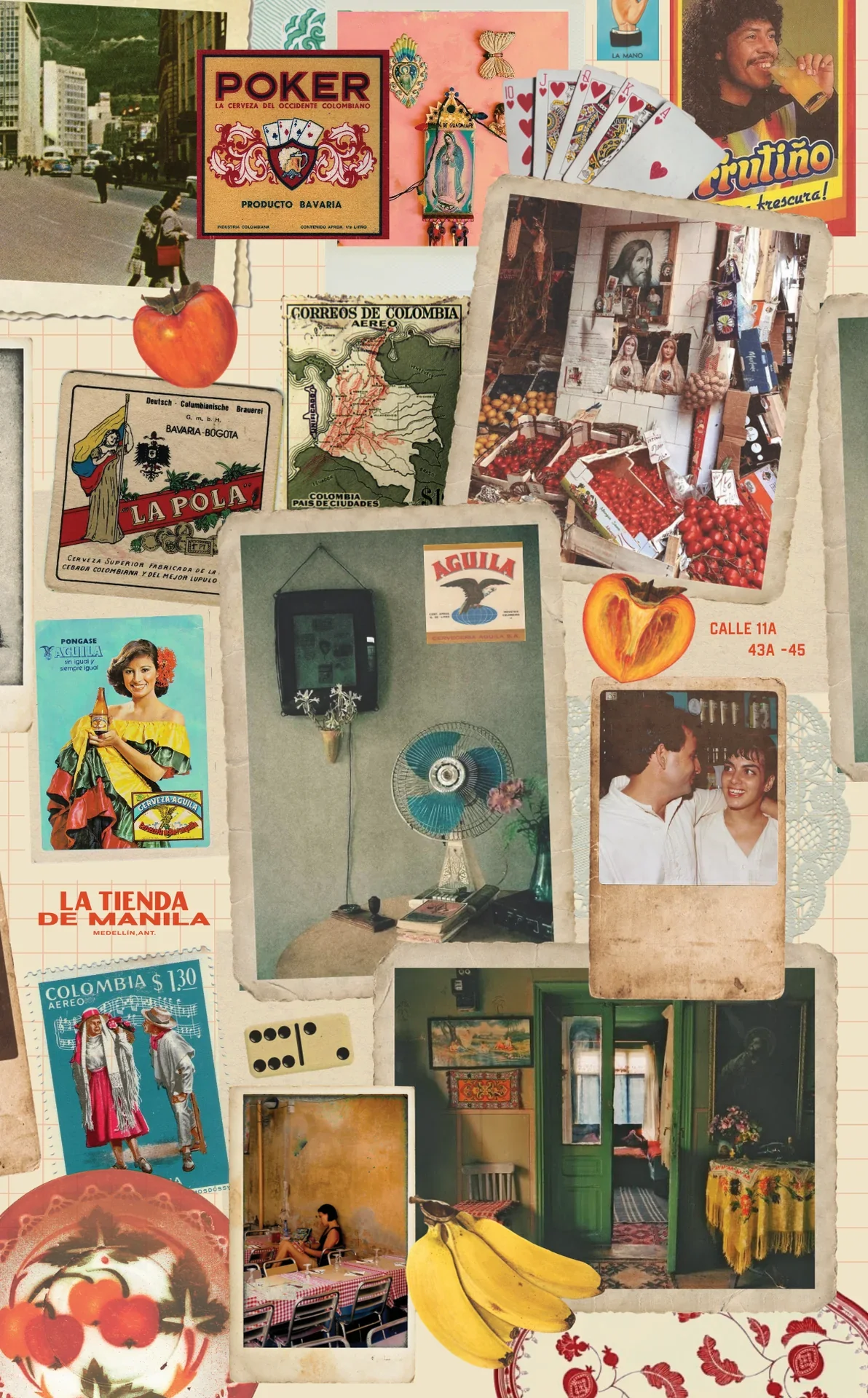
We created a visual language rooted in the codes of neighborhood shops, old advertising and everyday popular culture, then carried it through the full bar experience. Instead of limiting the identity to the obvious touchpoints, we brought it into the small functional objects guests and staff interact with every day.
Made to feel collected over time, not designed all at once.
/ VISUAL WORLD
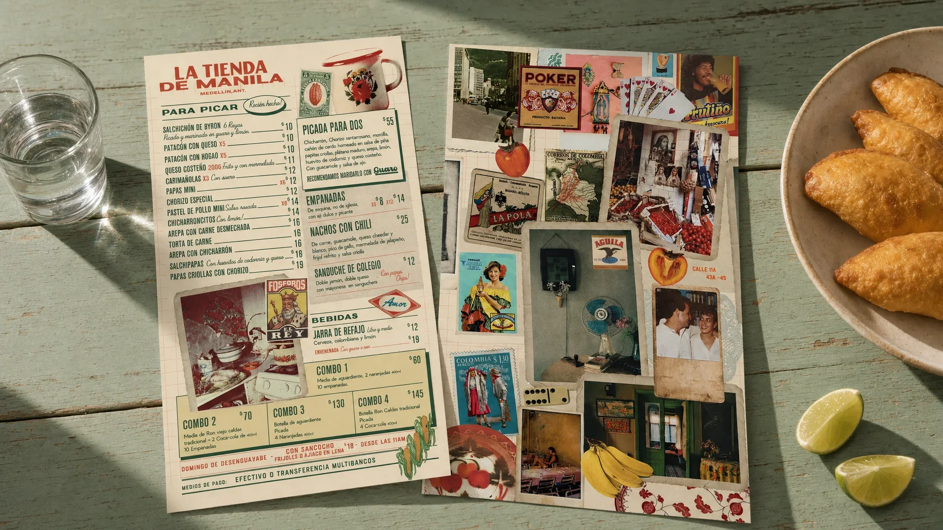
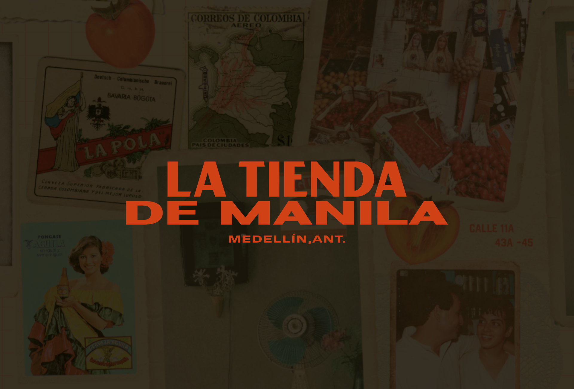
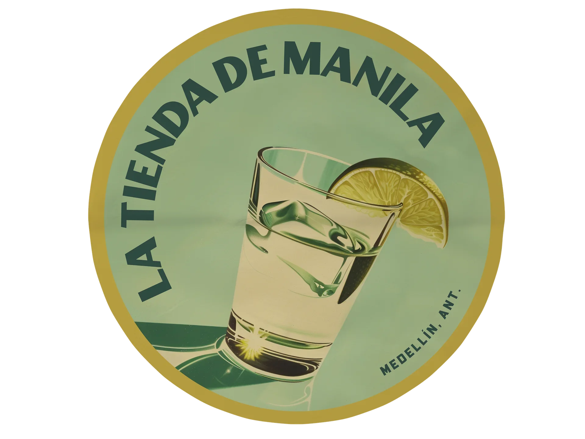
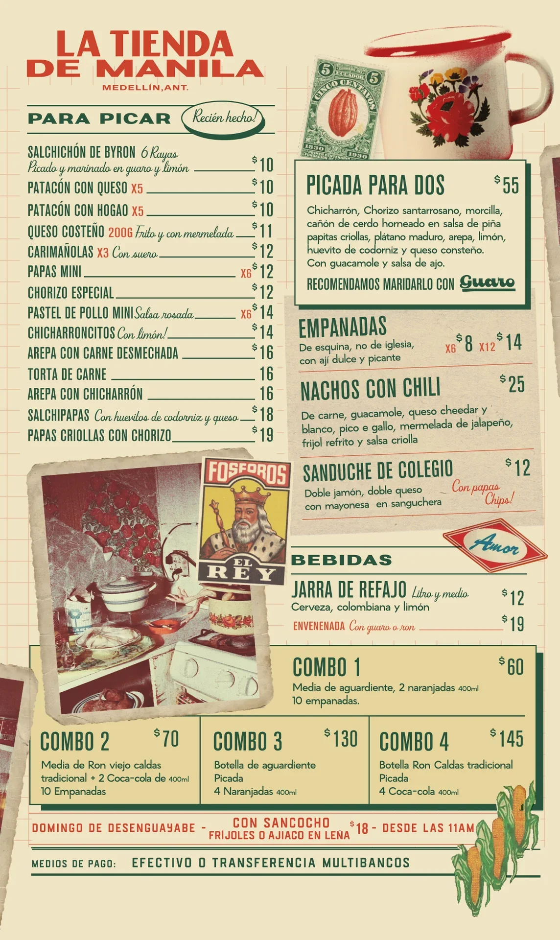
Corner stores, vintage advertising, food packaging, receipts, postcards, painted storefronts and familiar household objects shaped the visual world. A faded palette of cream, green, red and yellow, bold utilitarian typography and layered imagery give the identity the warmth and imperfection of something lived-in.
Food & Drink Menus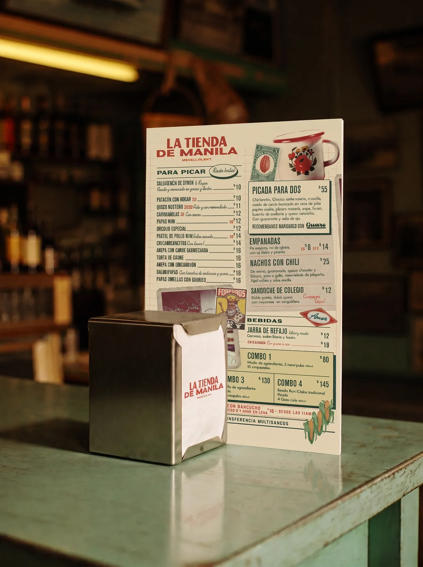
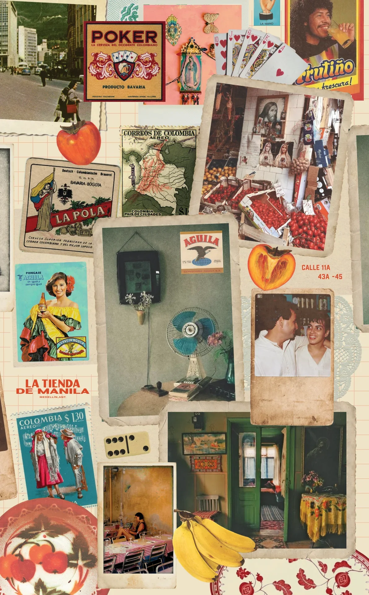
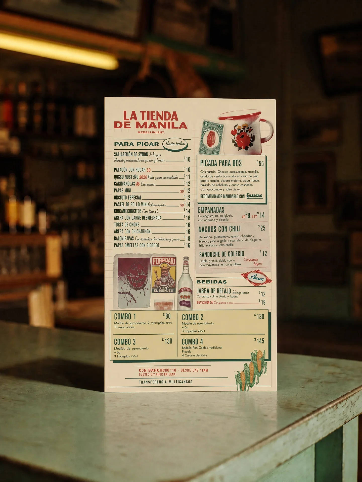
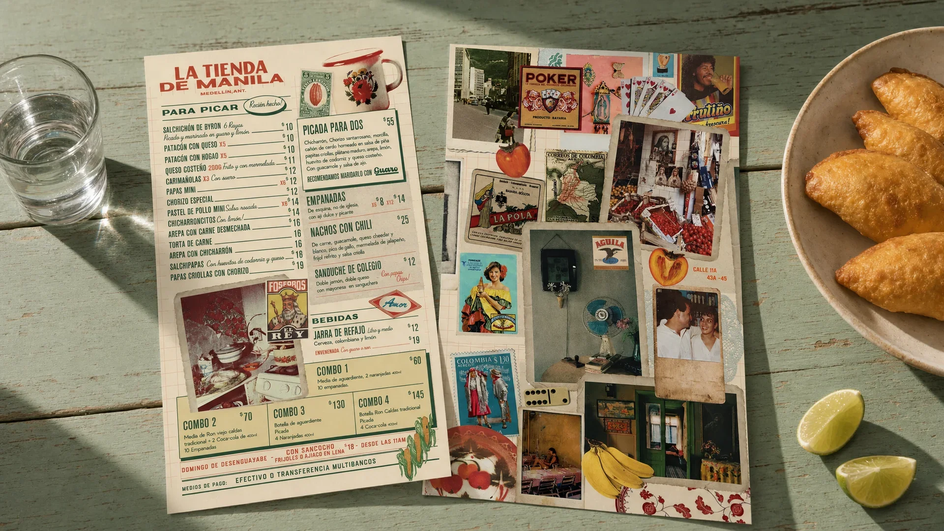
BEYOND THE MENU
The visual world extended into packaging, postcards, napkins, order pads, stickers and entrance signage. Bringing the identity into these everyday touchpoints made the bar feel more complete — as if the brand belonged to the place rather than simply being applied to it.
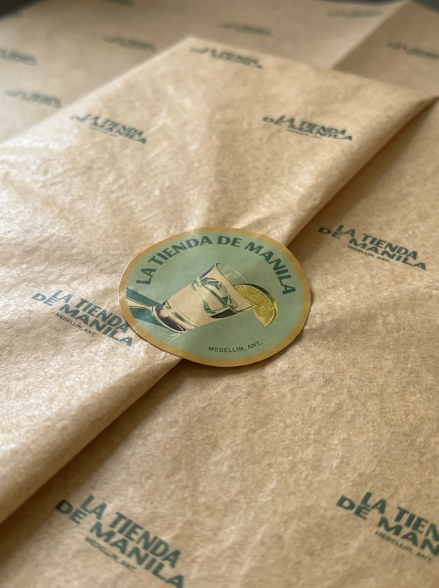
Packaging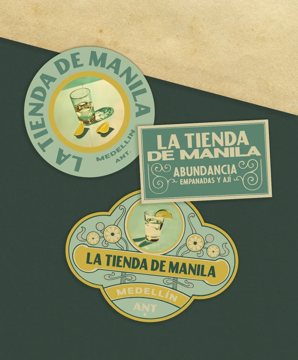
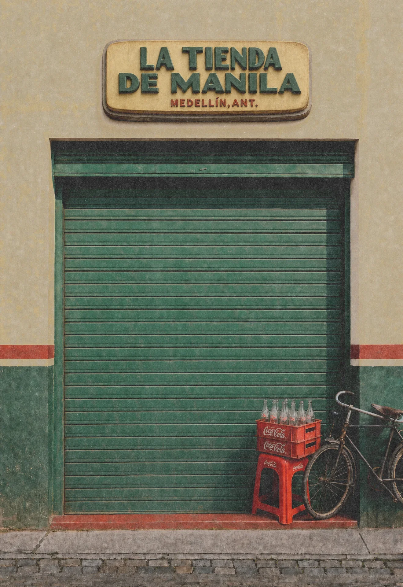
Lightbox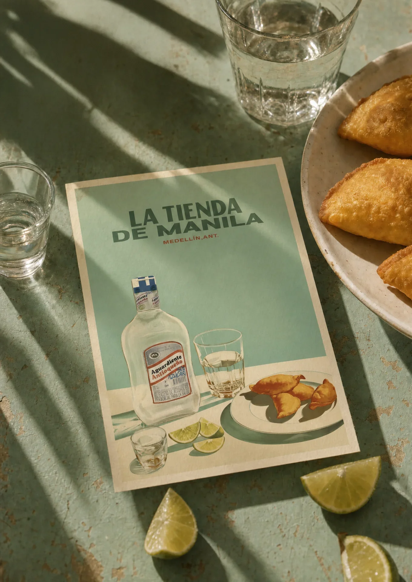
Postcards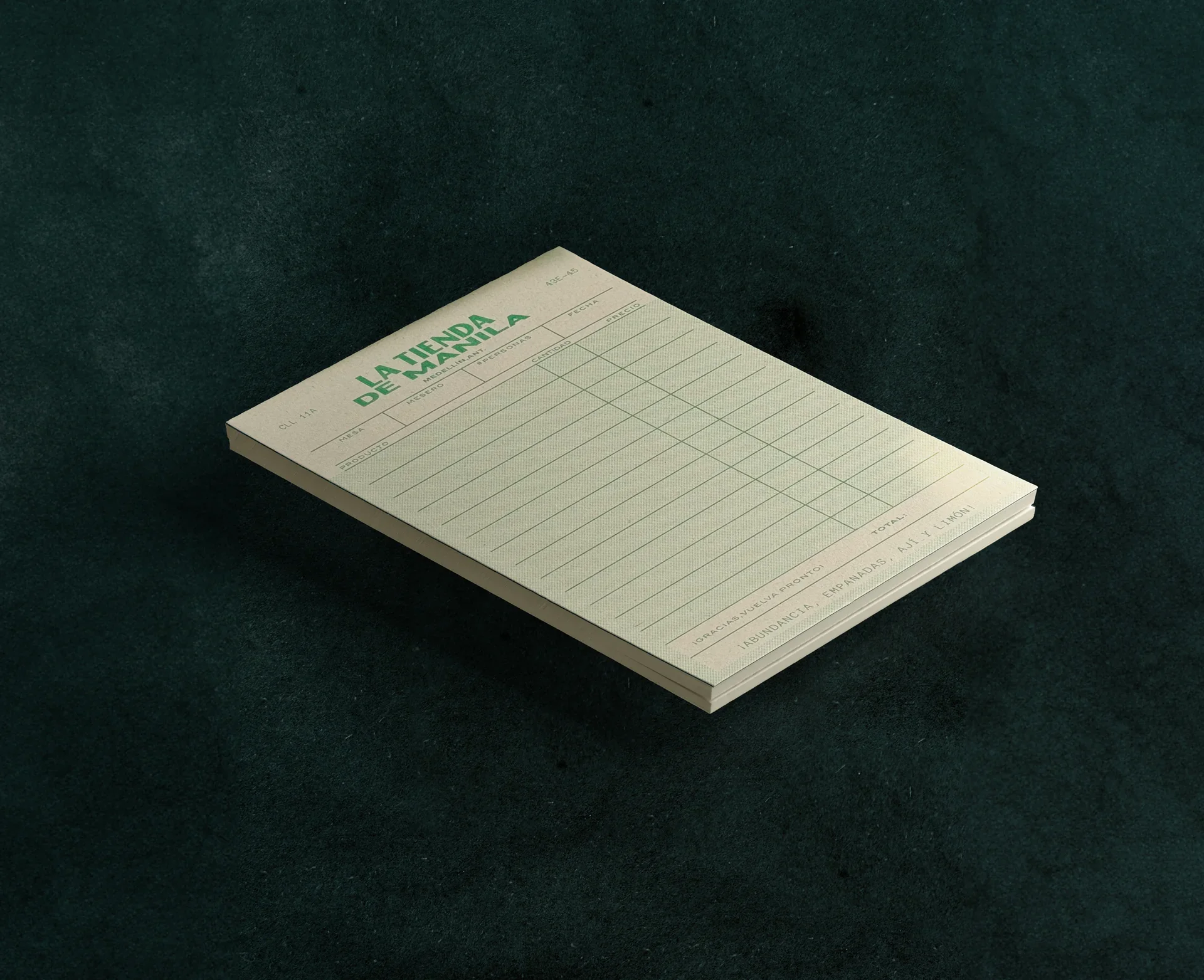
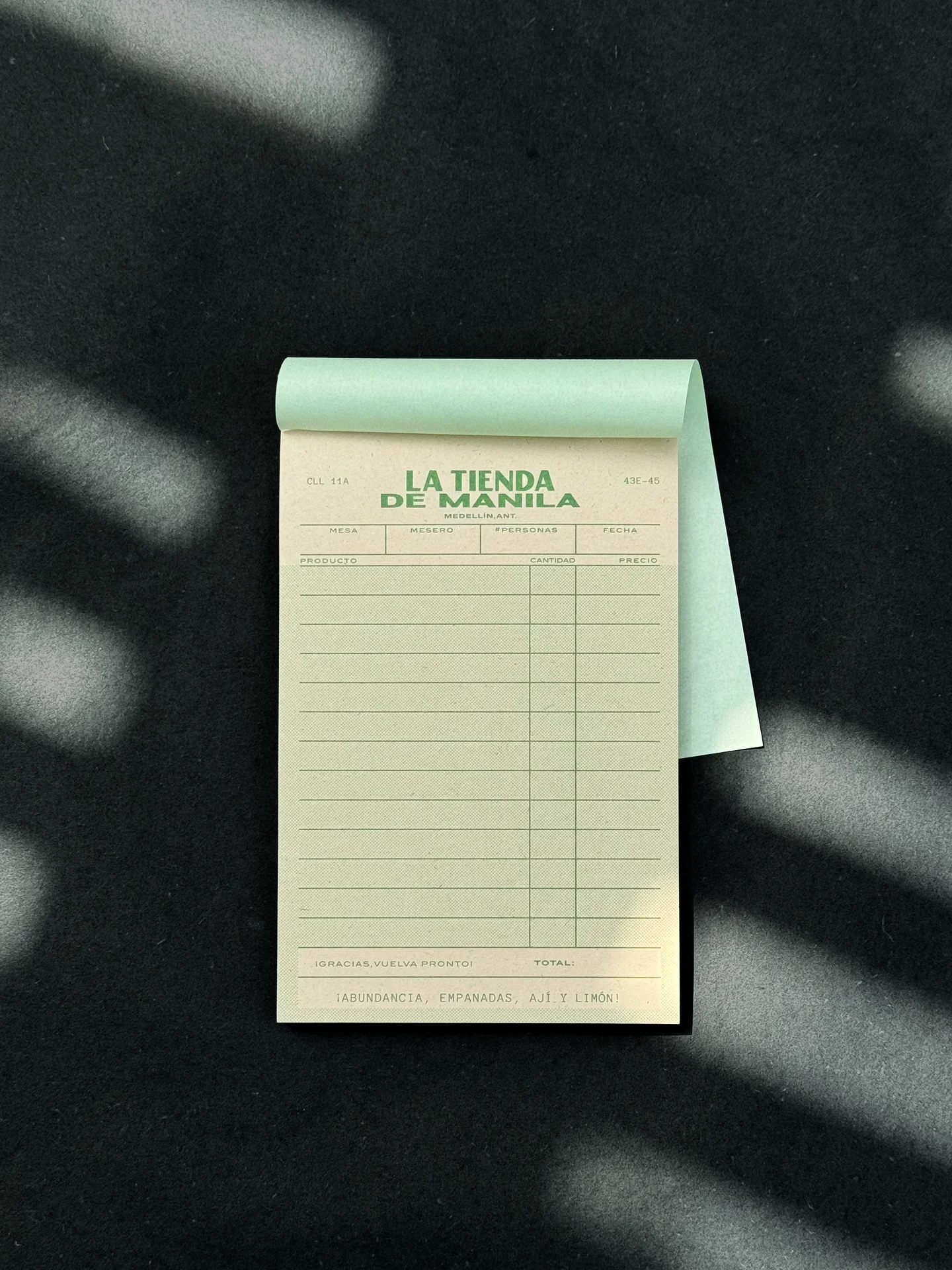
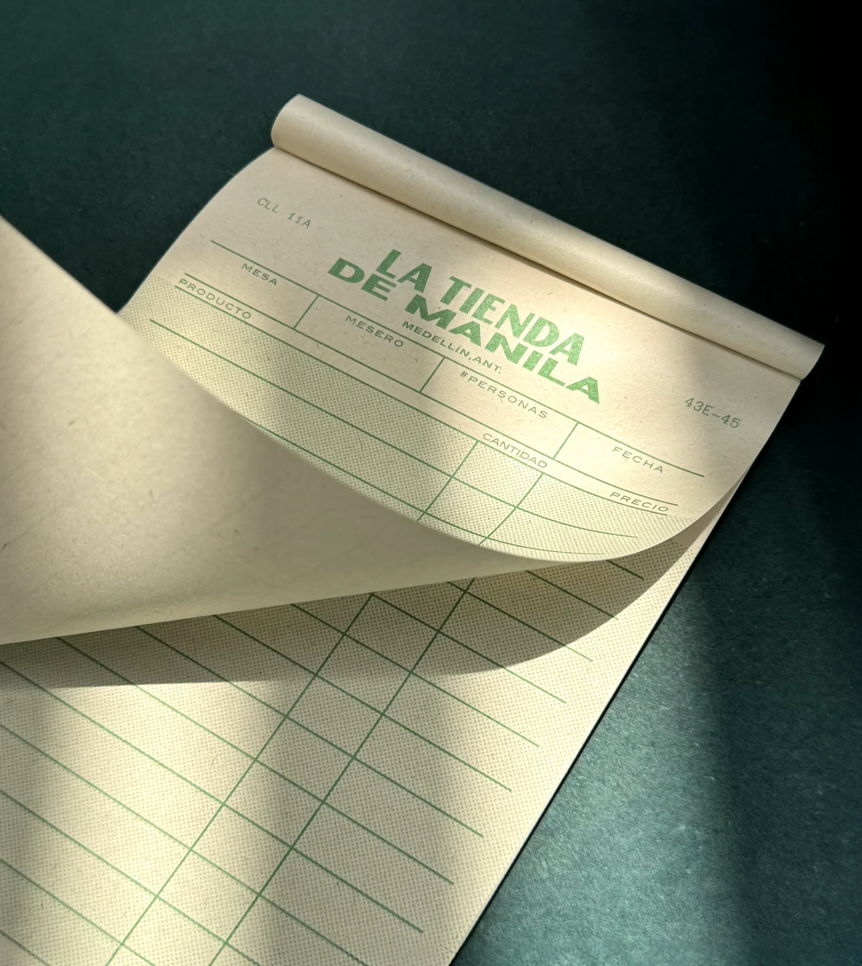
Order PadsA new bar with the familiarity of a place that has been there for years.
/ OUTCOME
The final identity carries the same story across menus, packaging, signage and service details, helping the bar feel cohesive without feeling overly designed. Each touchpoint adds to the atmosphere and makes the experience feel familiar, layered and full of character.