

Los Porteños
A home-grown pastry business becoming a brand people could step into.
Los Porteños is an Argentinian bakery founded by pastry chef Agustín, who built the business around the flavors he grew up with in Buenos Aires. What started from his home kitchen in Medellín grew through word of mouth and delivery before opening its first physical location.
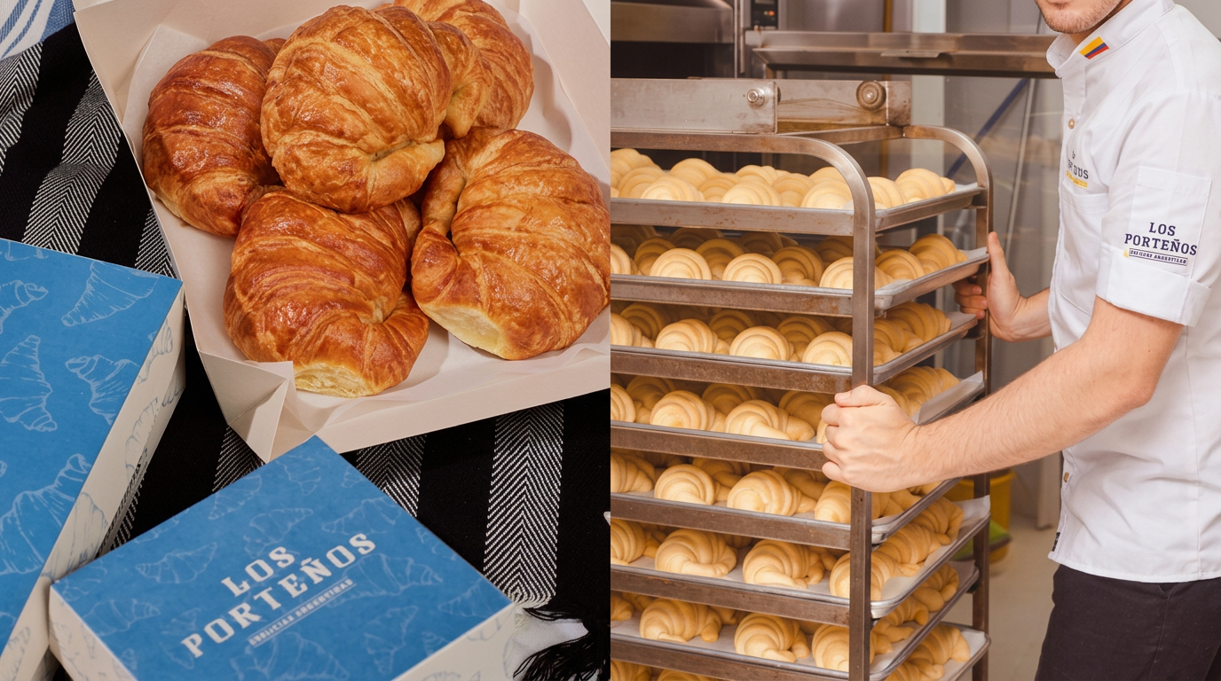
LOCATION:YEAR:MEDELLÍN, COLOMBIA2021BAKERY VENUE TYPE:AREAS OF WORK:BRAND / SPACELOGO DESIGNBRAND BOOKMENUSPACKAGINGPASTRY SHEETSSOCIAL MEDIA POSTSLIGHTBOXESA business built around food, memory and one very recognizable personality.
/ CONTEXT

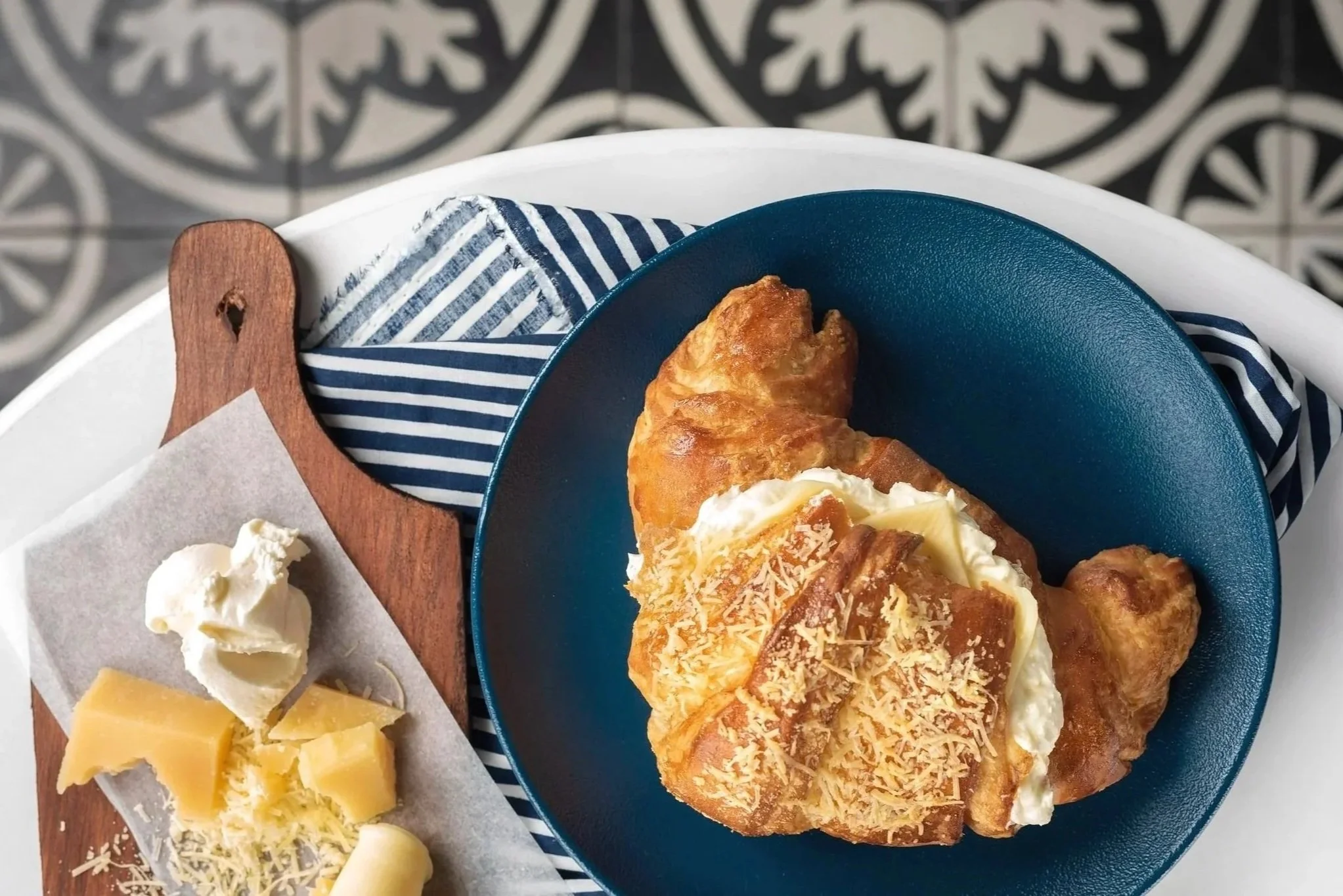
Agustín brought the pastries he grew up with — medialunas, alfajores, pasta frola and other classics — to the city he now calls home. His warmth, humor and love of sharing the stories behind the food became as much a part of Los Porteños as the pastries themselves.
From home kitchen to physical destination.
/ OPPORTUNITY
Growing demand was taking Los Porteños into its next chapter: its first public location. The brand needed to grow with the business, working across a storefront, menus, packaging and digital touchpoints while keeping the personal, welcoming character people already connected with.
Build the brand around the story that customers already loved.
/ OUR APPROACH
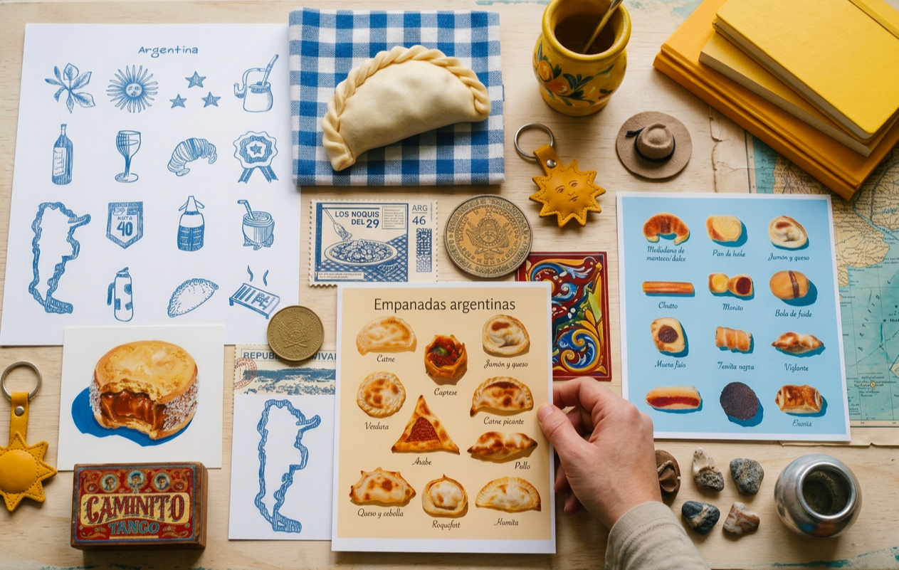
Rather than creating a generic “Argentine” bakery, we used Agustín’s own story as the starting point. Familiar references from Buenos Aires gave the brand its roots, while a brighter, more contemporary system helped it feel at home in Medellín and ready for a larger audience.
Nostalgic at heart, bright and contemporary in expression.
/ VISUAL WORLD
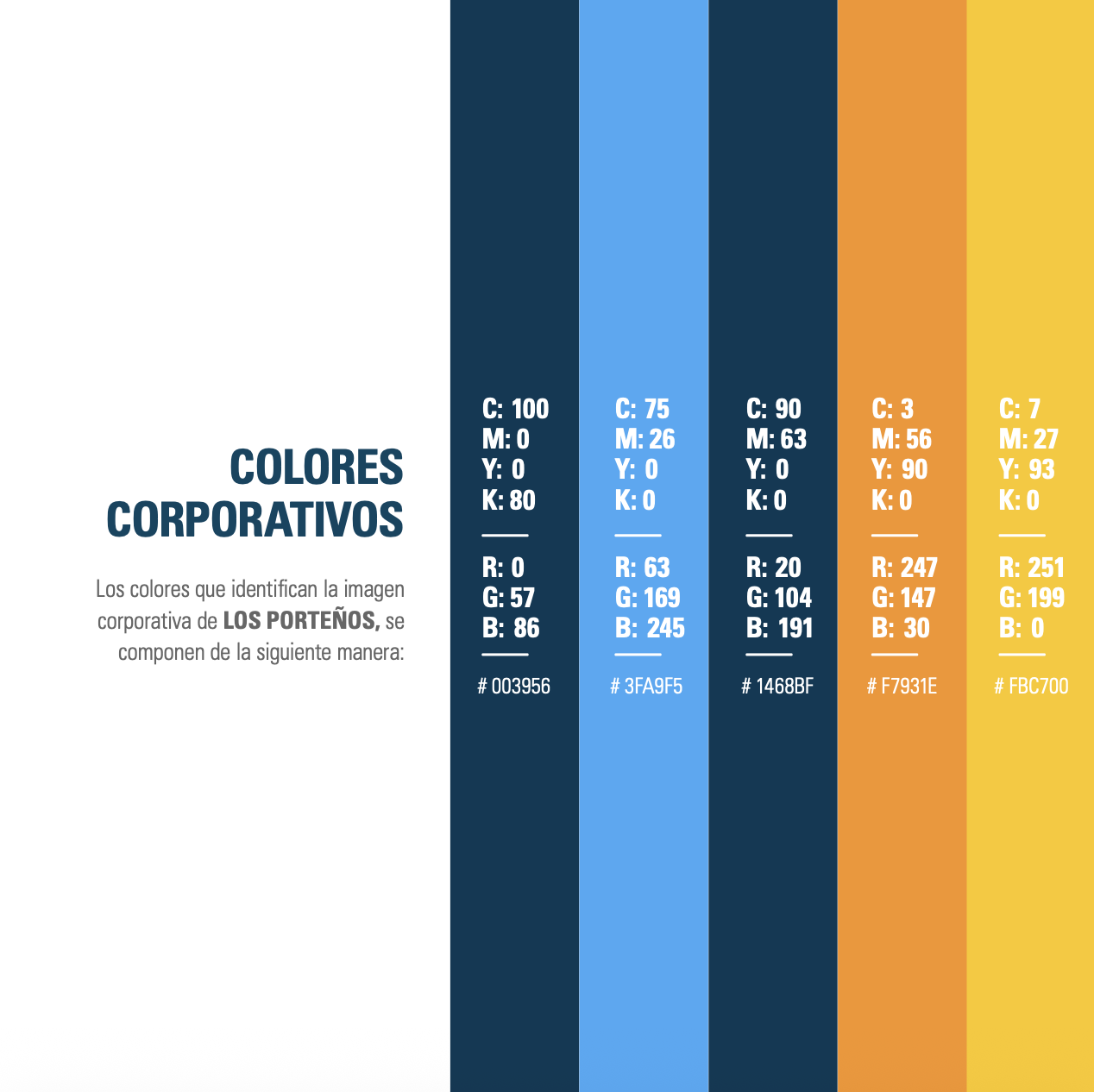
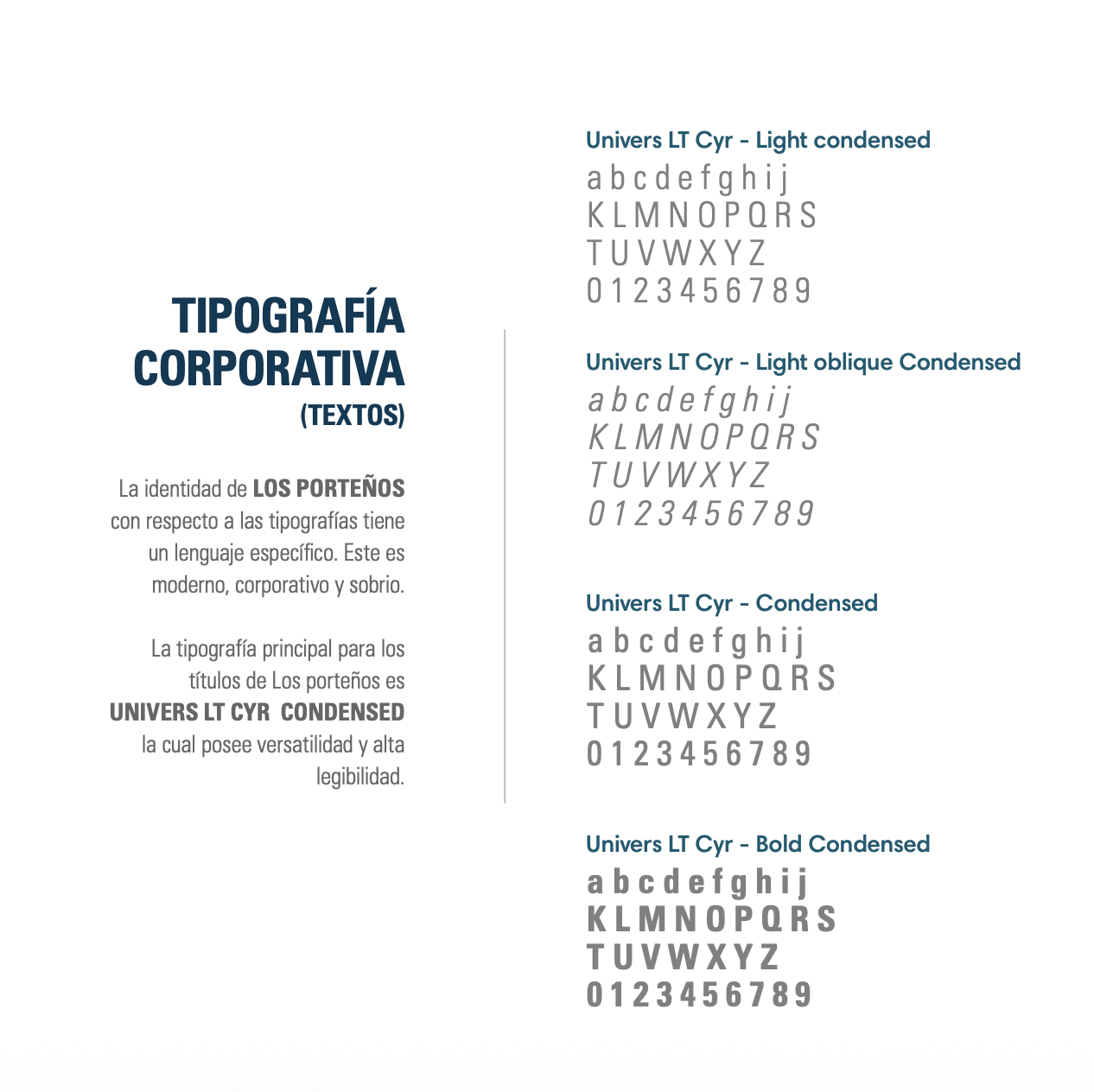
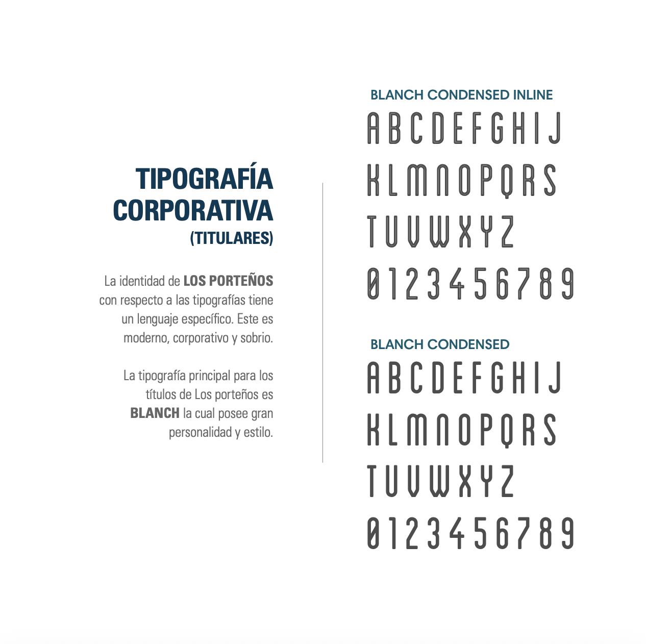
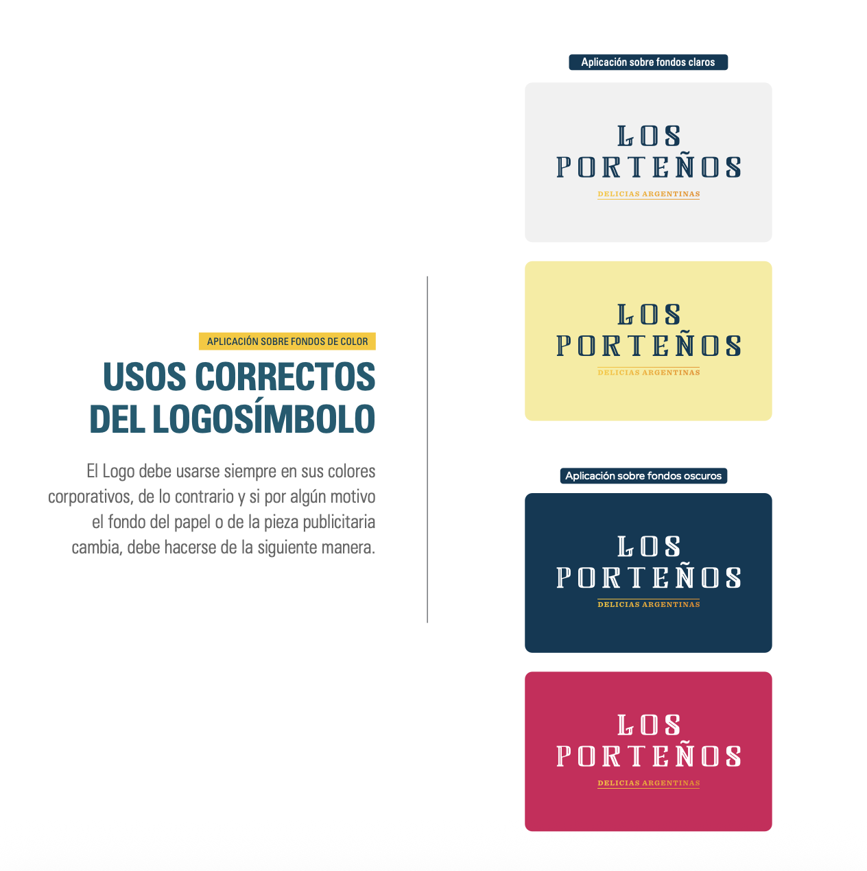
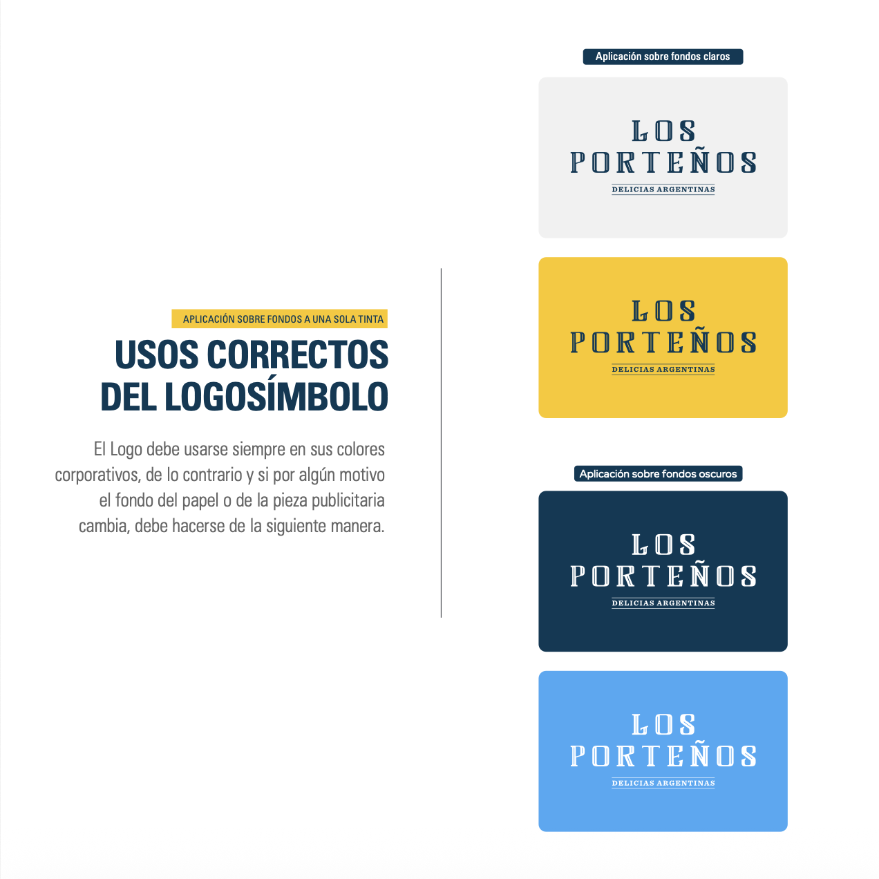
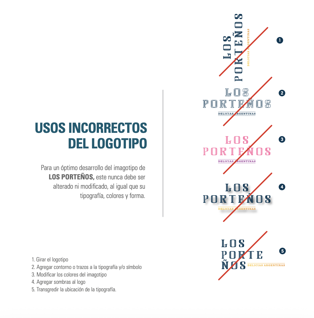
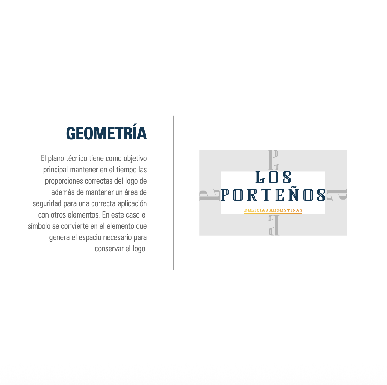
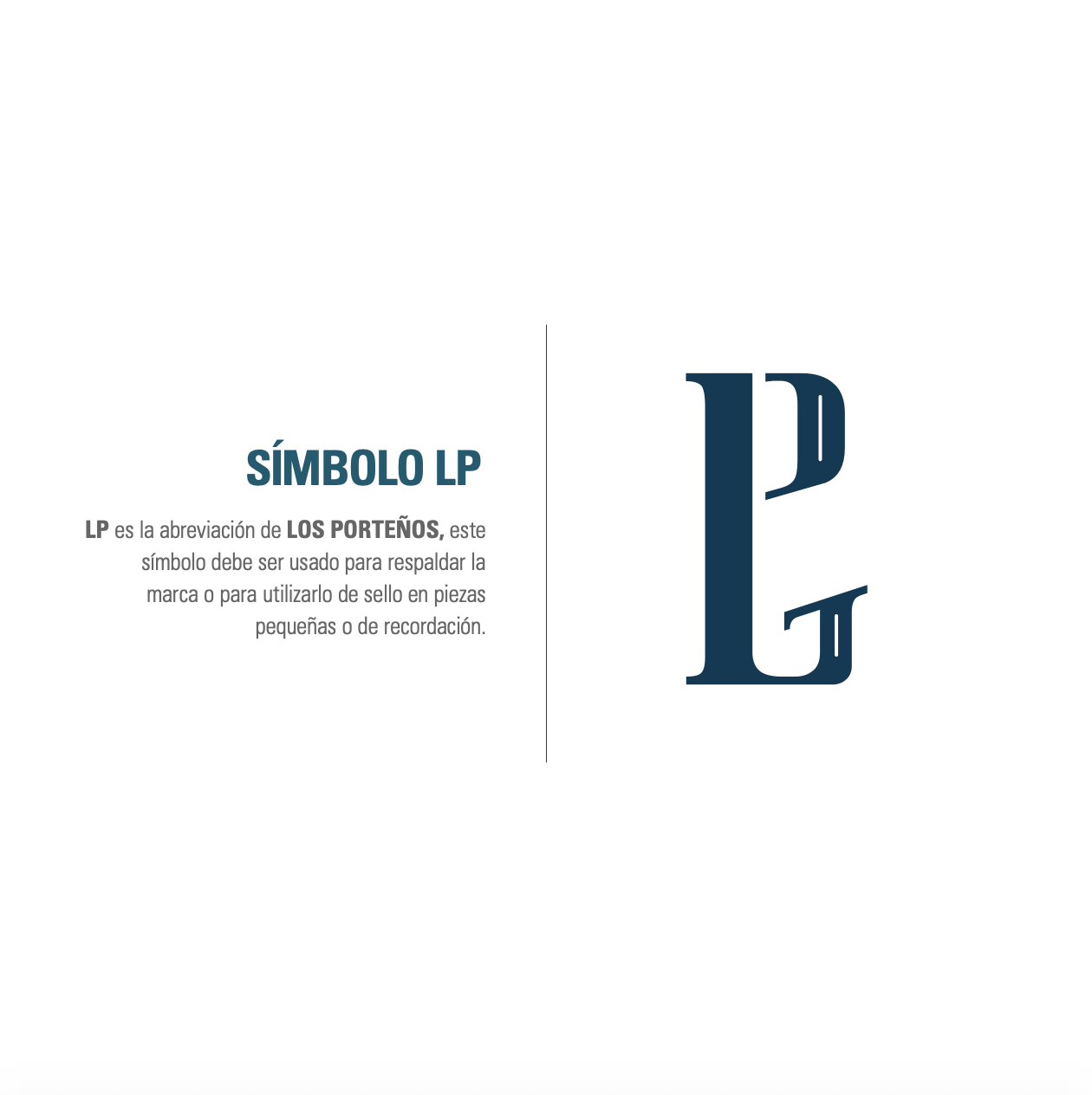
Neighborhood bakeries, traditional pastry packaging, street graphics and everyday visual references from Buenos Aires shaped the identity. Deep blue, light blue, orange and sun-inspired yellow created a recognizable palette, while bold typography and the LP monogram gave the system enough flexibility to move across many different applications.
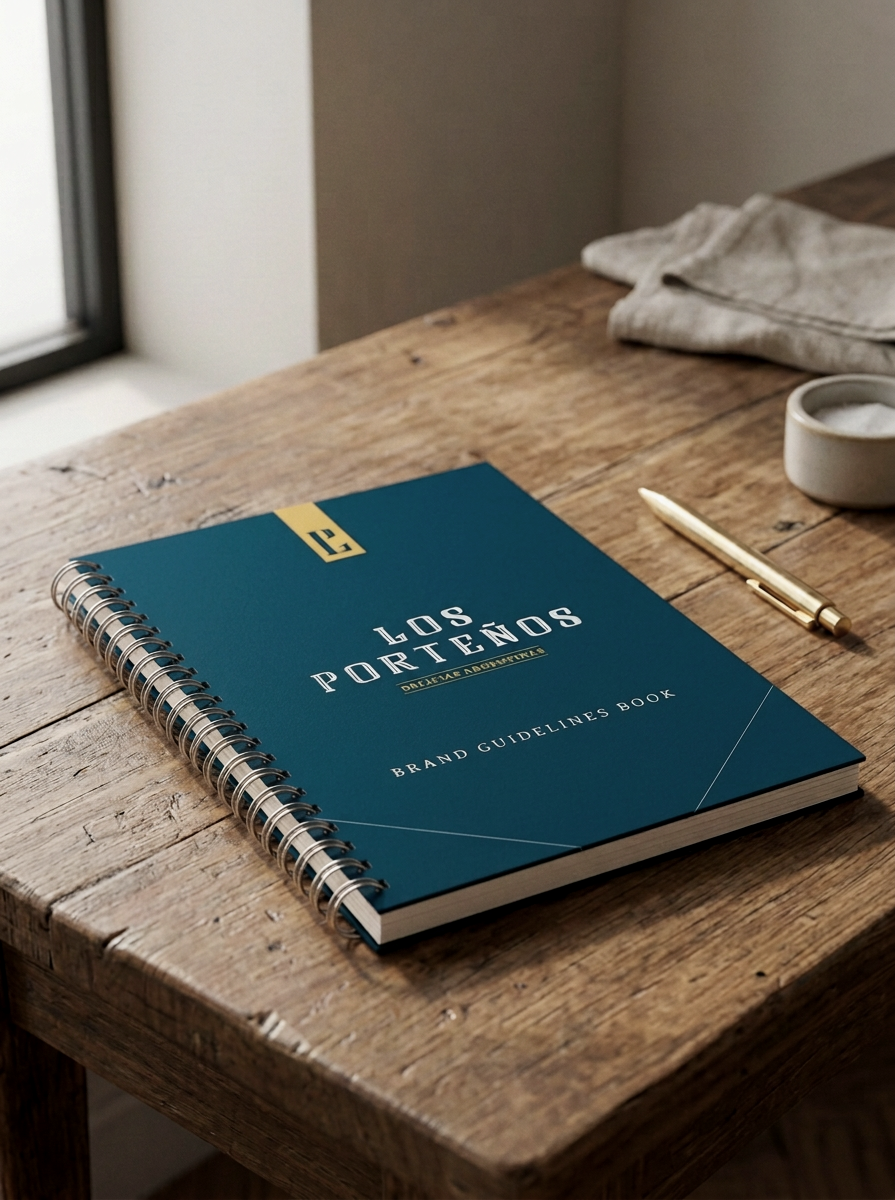
Logo & Brand Guidelines Book

Beyond the Logo
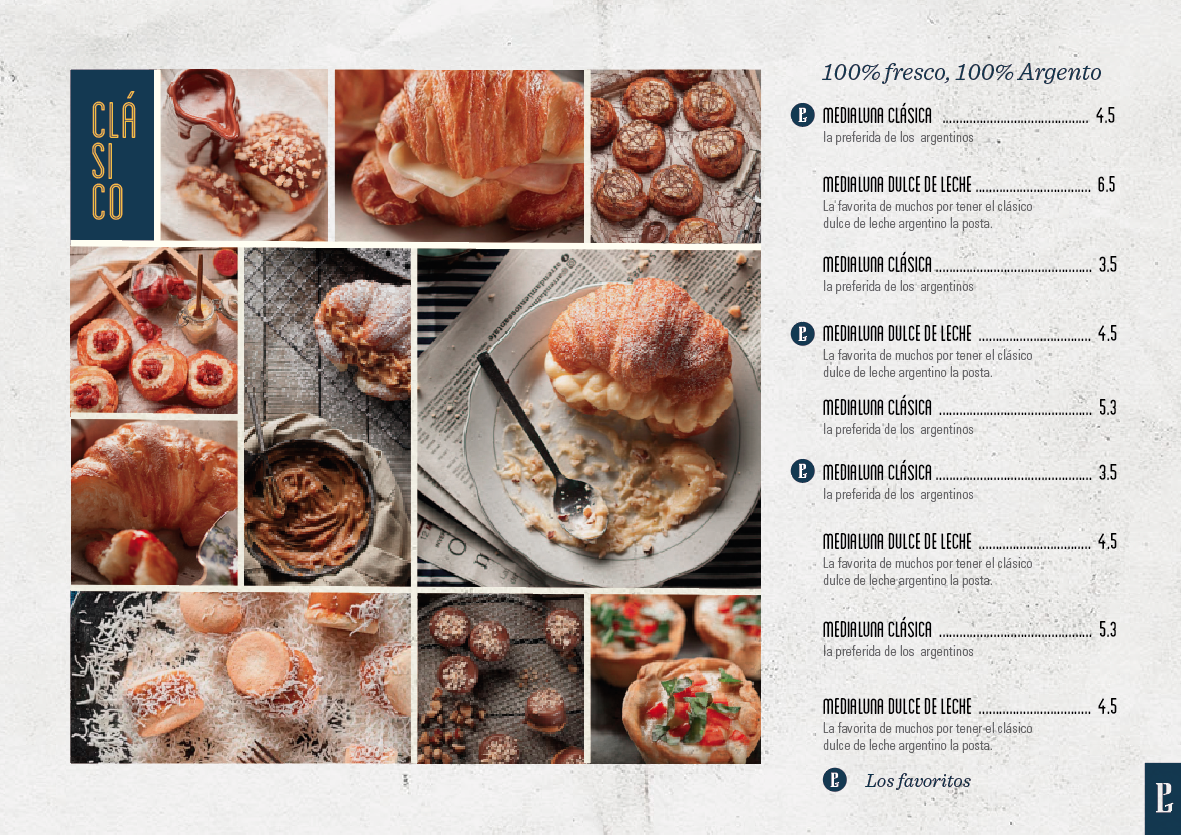
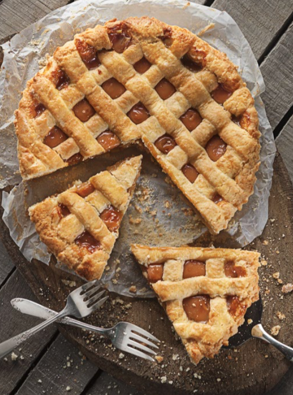
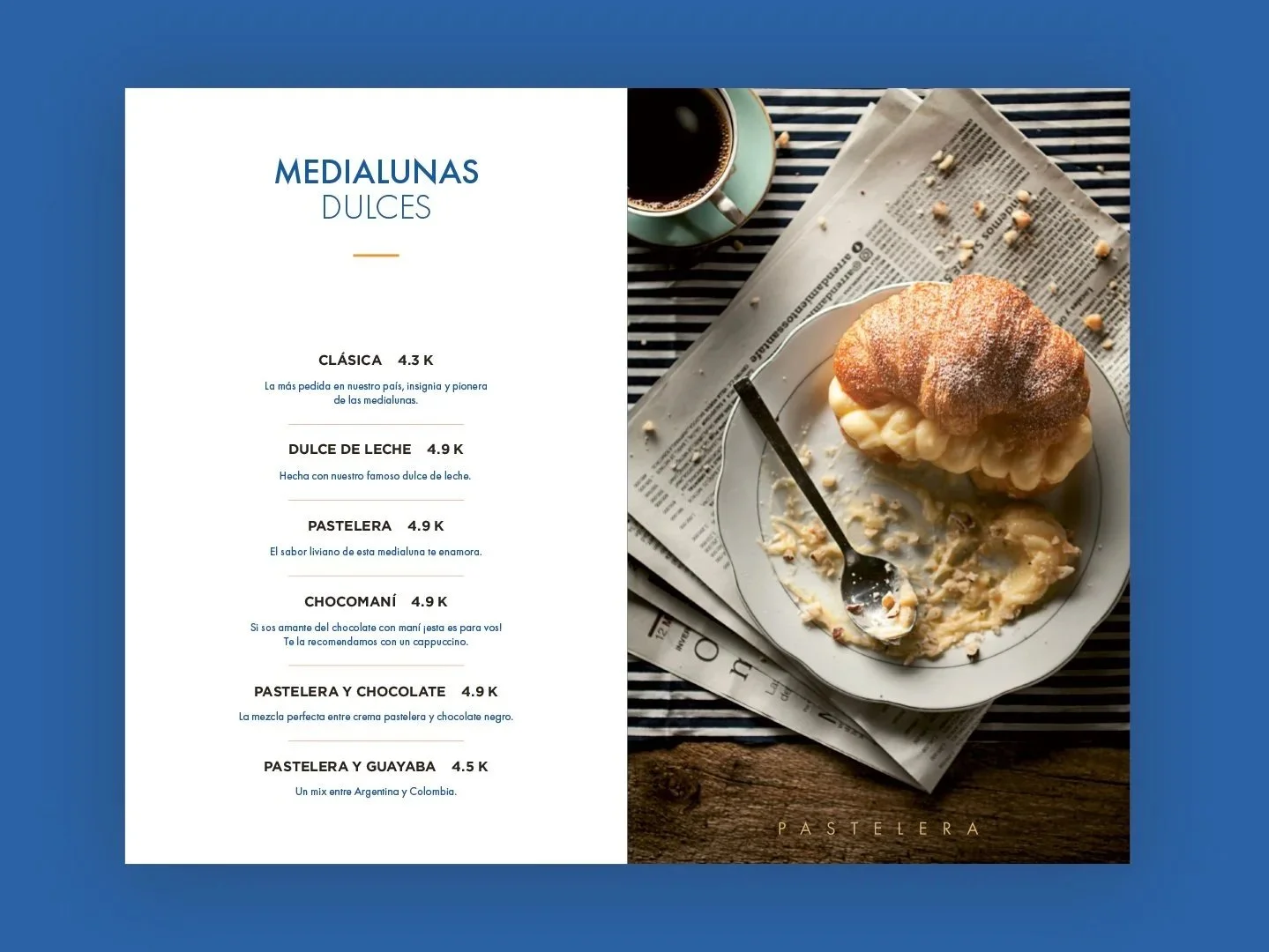
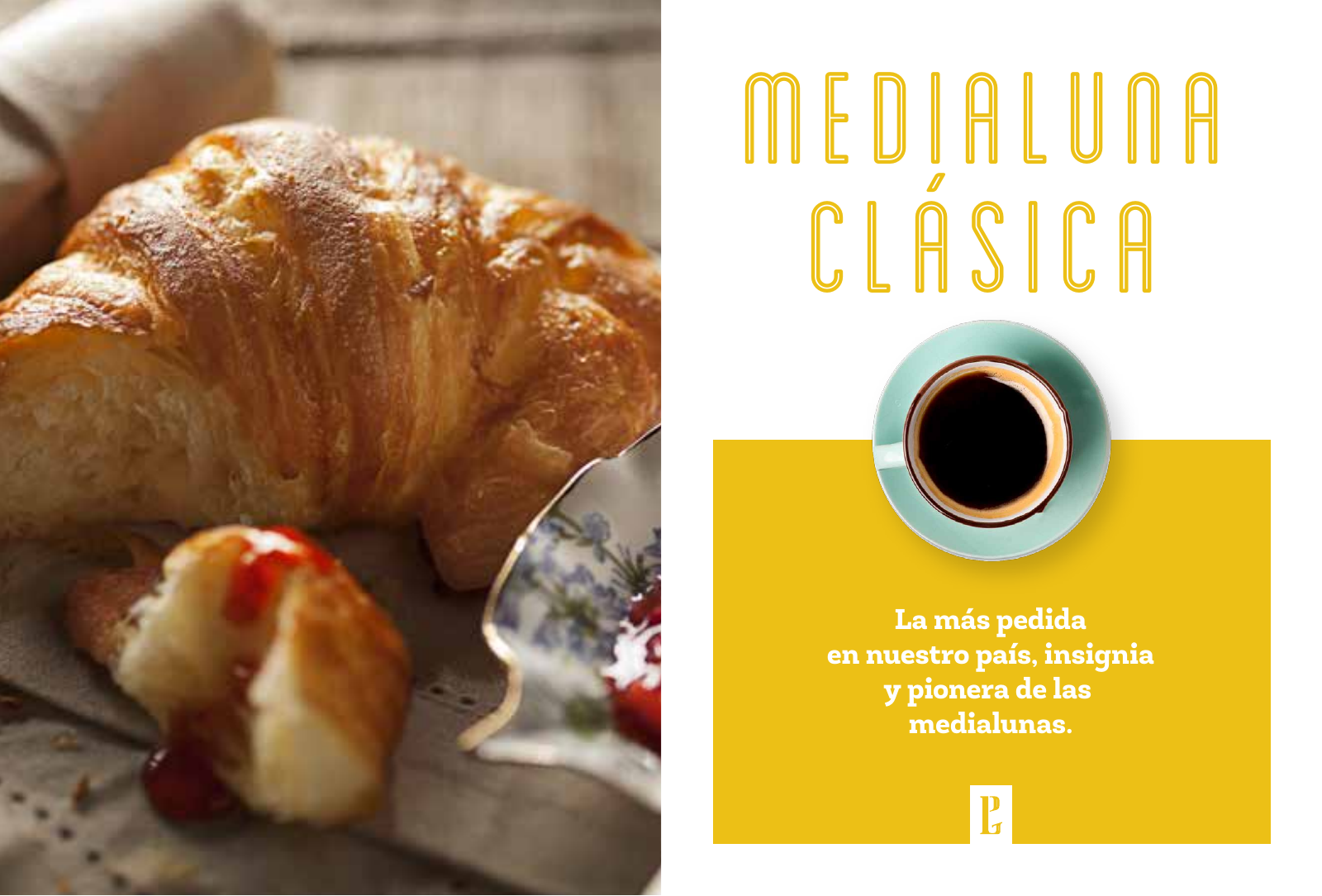
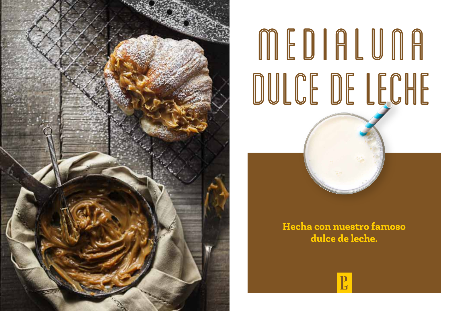
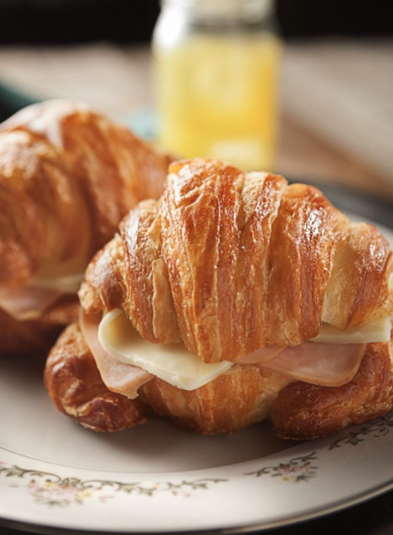
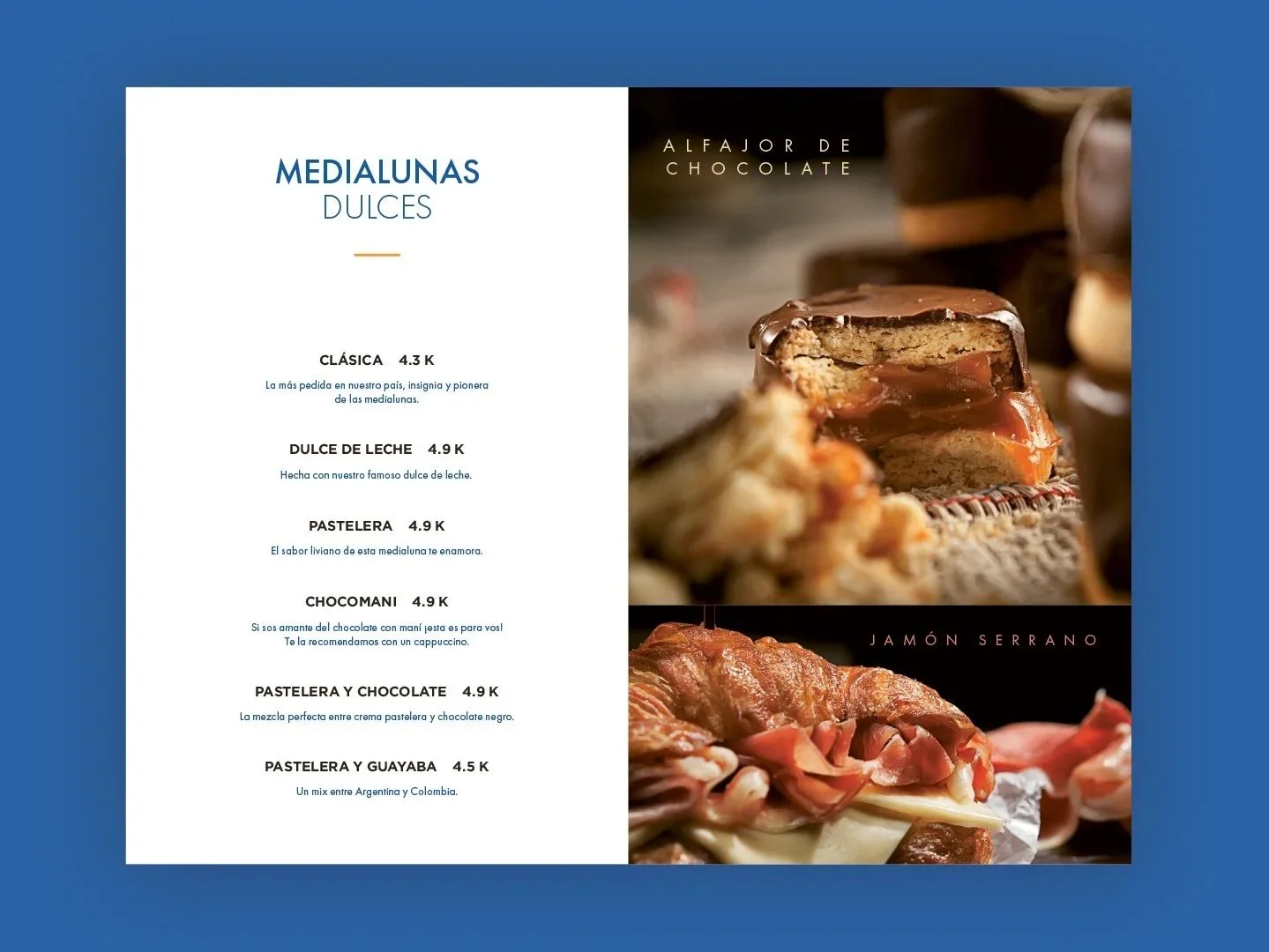
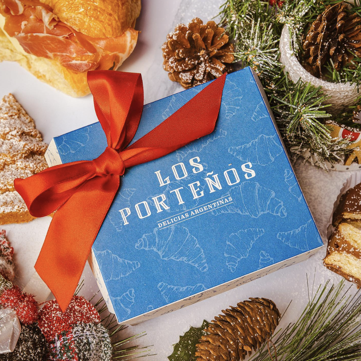
The identity extended into menus, packaging, storefront signage, printed materials, social content and photography. Each piece helped turn what had been a home-based business into a more complete and recognizable experience across both the physical and digital brand.
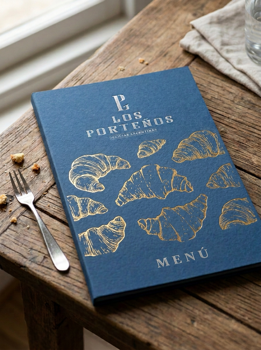
Menu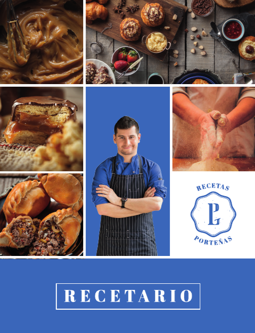




Packaging & Pastry Sheets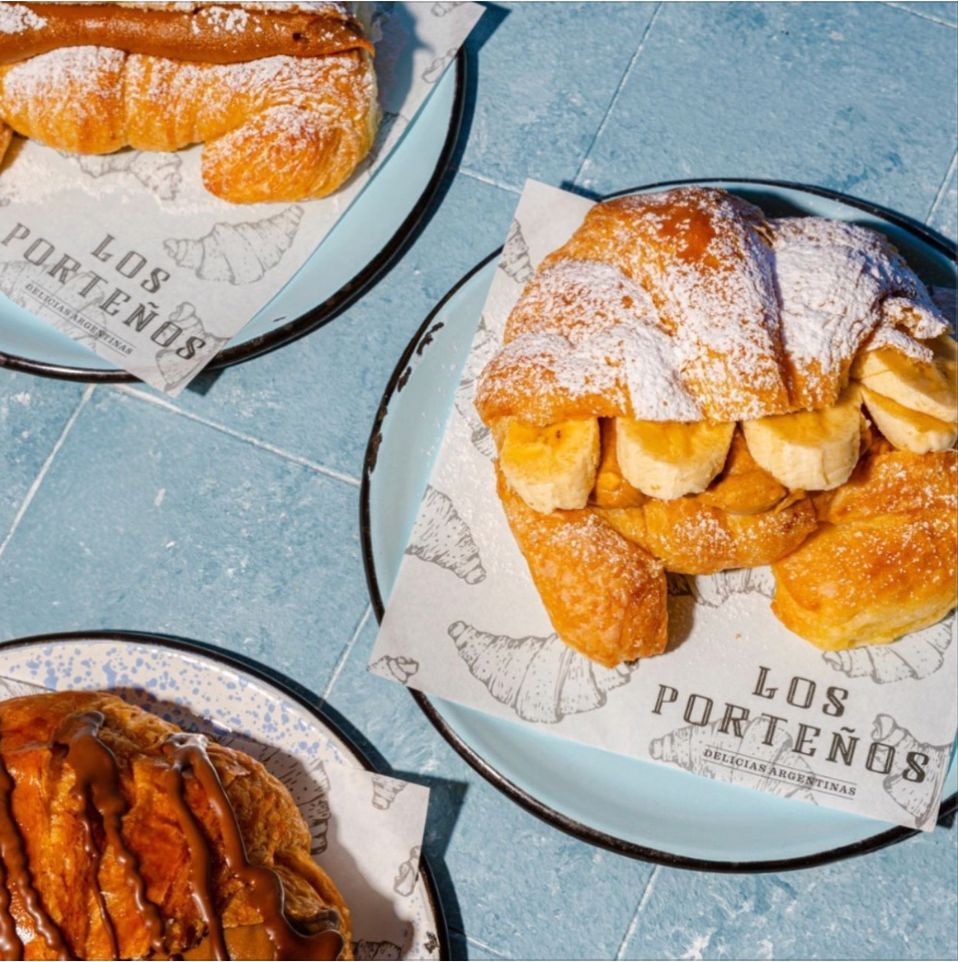

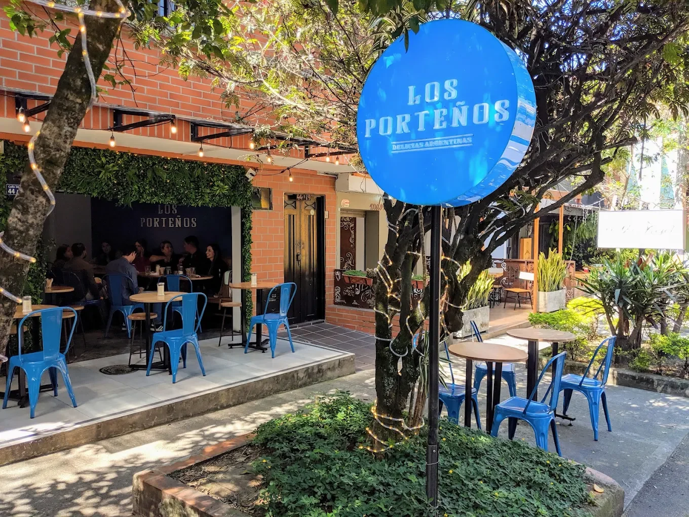
Lightboxes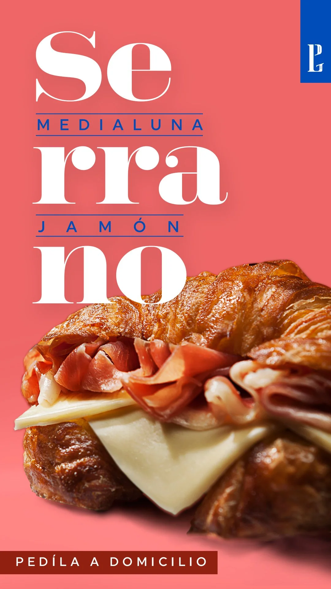
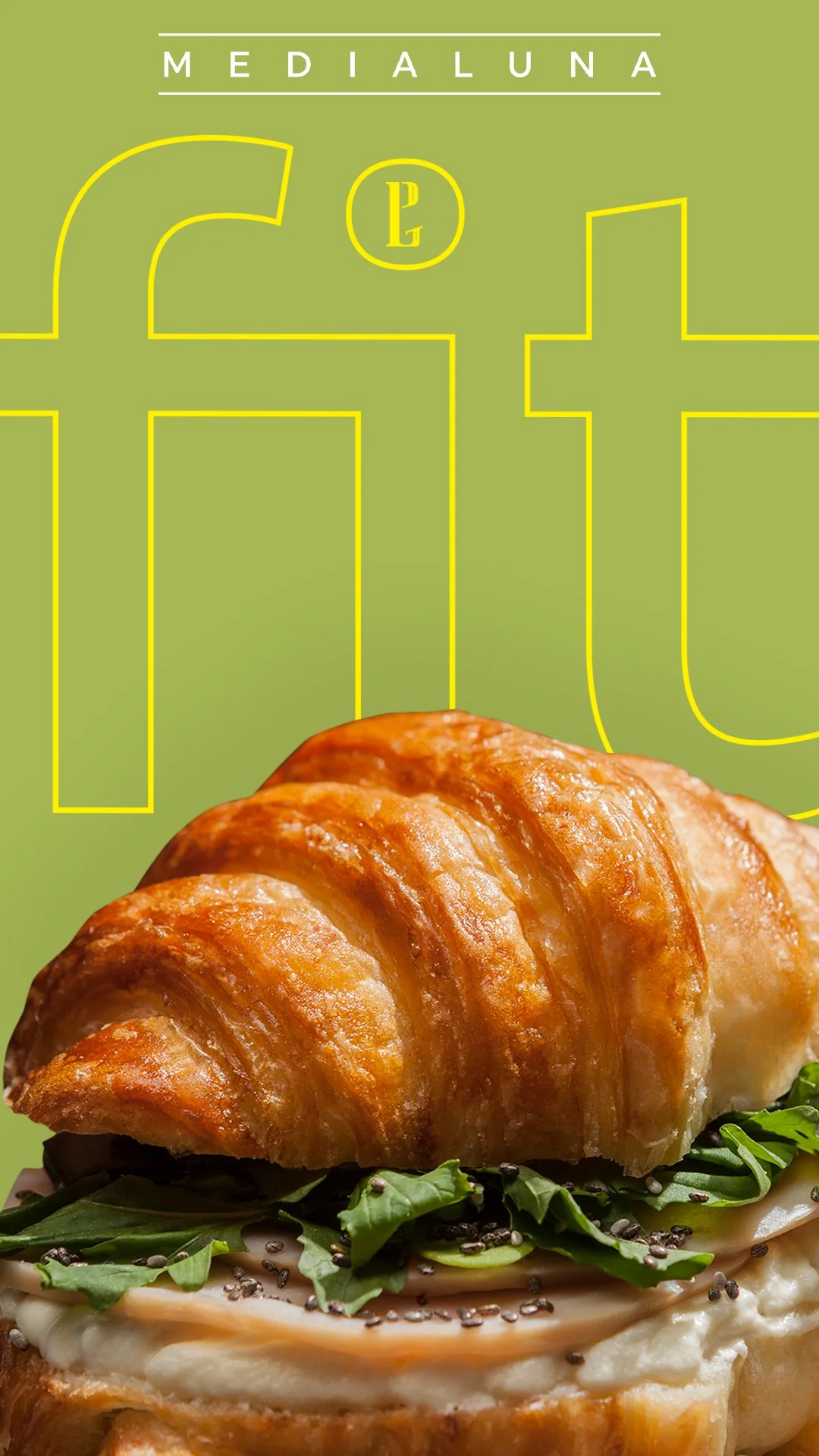
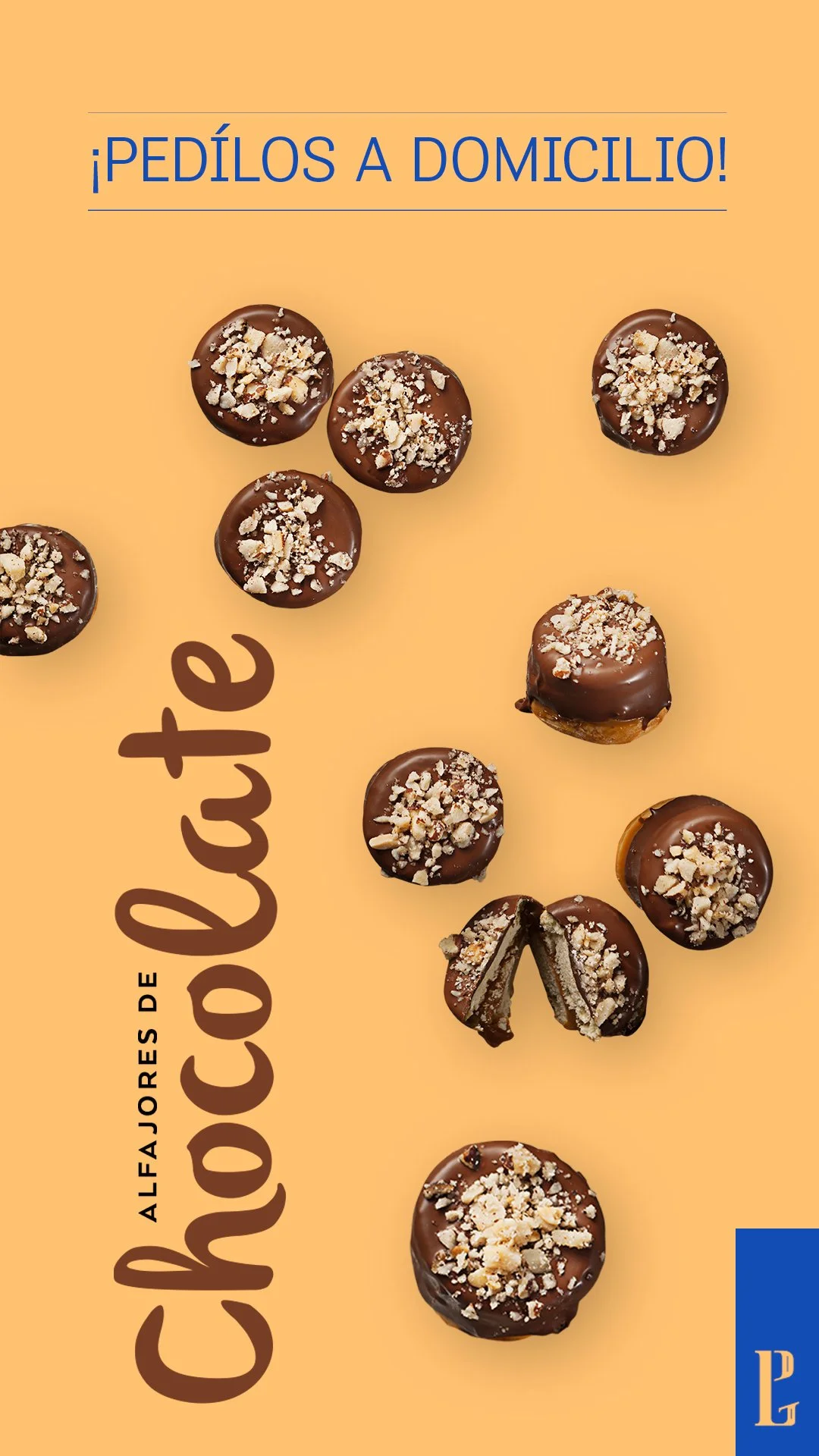
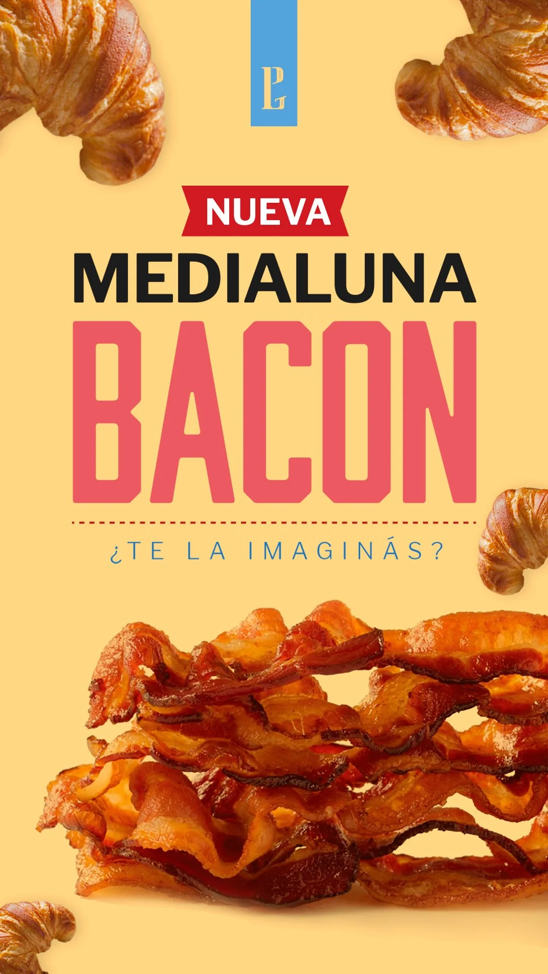
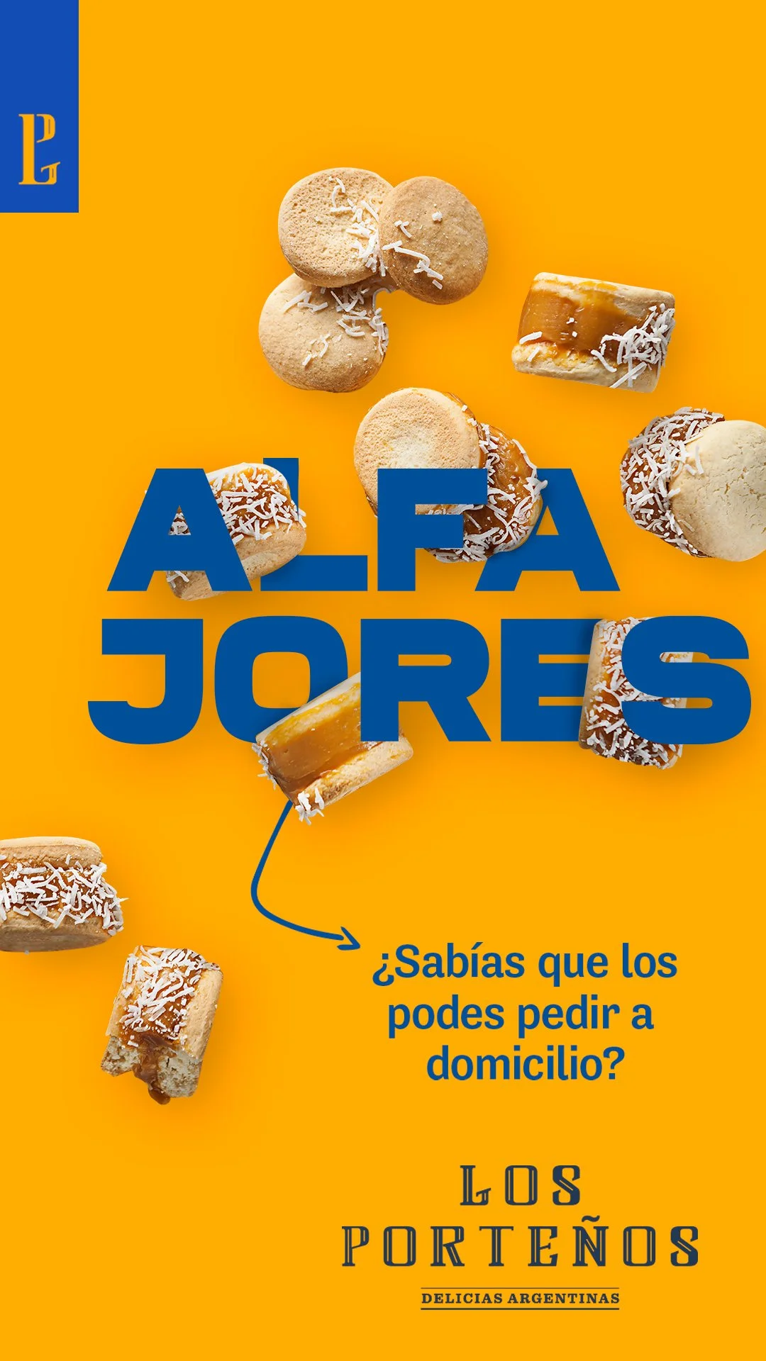
The new system gave Los Porteños a consistent identity as it moved from home delivery into its first physical location. The business could now show up clearly across the storefront, packaging, menus and digital channels without losing the warmth and personality that had made people connect with it from the beginning.